Quantcast
Channel: HowtoInvestOnline
Viewing all 96 articles
Browse latest View live

Corporate Sustainability (aka SRI/ESG) in Canadian Consumer Stocks

$
0
0
Last November when we first explored the idea of investing according to principles of social responsibility (abbreviated to SRI), often also called Environmental, Social and Governance (ESG) investing, or simply Corporate Sustainability, we focussed on the available SRI/ESG mutual funds and ETFs and used them to look at recent performance of the stocks held in these funds.

Today, we'll return to the topic. A first motive is that those funds are the not final word on which companies merit inclusion. They do not necessarily include all stocks that meet Sustainability principles since the funds attempt to have a mix of holdings across many sectors and thus may neglect worthy companies. Second, there is growing evidence that investors can make money by paying attention to Sustainability. The paper The Added Value of ESG/SRI on Company and Portfolio Levels – What Can We Learn From Research? reviews the literature and finds a positive relationship between company financial performance and the adoption of Sustainable practises. In another paper, The Impact of Corporate Sustainability on Organizational Processes and Performance, Harvard Business School researchers Robert Eccles, Ioannis Ioannou and George Serafeim found that SRI/ESG adopters outperformed both in stock market and accounting terms. Moreover, "The outperformance is stronger in sectors where the customers are individual consumers instead of companies, companies compete on the basis of brands and reputations ...".

Therefore, we will focus on consumer facing companies.

Finding the consumer stocks
Using the free TMX Money stock screener, we selected the Consumer Defensive sector to extract an inital list, cutting it off at companies with $1 billion or more in market cap, to which we added hardware retailer Rona Inc and fast-food vendor Tim Hortons and from which we removed three companies (Saputo, Maple Leaf Foods and Canada Bread) that don't deal directly with consumers.

Getting the "green" info
Unfortunately, and hopefully this will change soon since the data is useful and important to a growing number of individual stock investors, it is not easy to get the data on how much or well companies have implemented Sustainable policies. Bloomberg and Thompson do compile such data and it is available to institutional investors paying the hefty fees but the individual investor is left to troll through corporate documents like the annual report, the management information circular (aka the proxy circular) or presentations freely available on the company Investor Relations website area or on Sedar (under the Search Database tab). So that's what we did and compiled the comparison table below, which we note may not be 100% accurate since some factors are often not very clearly explained - especially the degree to which to which executive compensation is tied to ESG results.

Three key Sustainability factors
The Harvard paper says three indicators explain best the combination of Sustainability adoption and financial success of consumer-facing companies:
  1. Separate Board of Directors committee devoted to Sustainability - If it important enough to the company that the top level policy people are paying attention, it apparently gets done.
  2. Executive compensation tied to Sustainability - If the top managers' pay depends on doing it, then they tend to do it.
  3. Formal stakeholder engagement processes are in place - The existence of mechanisms like surveys, focus groups and audits, to engage with customers, with employees, with the communities where they operate and with suppliers reduces risk and improves adaptability of the companies.
One other factor the study mentions, but which we were unable to compile data for, is that companies succeed better with a bigger proportion of large long term stable institutional investors, as opposed to ones who trade a lot over the short term. This help enable the company to take the long term view to implement Sustainability.

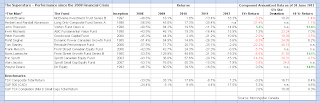
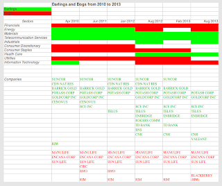
The results - who is green who is not
There are twelve companies in our list:
  • Only three seem to have adopted none of the three key actions - Rona, Alimentation Couche-Tard and Jean Coutu. 
  • None has adopted every single measure either. 
  • All four companies that are held by the iShares Jantzi Social Index Fund (symbol: XEN) - Tim Hortons, Loblaw, Canadian Tire and Shoppers Drug Mart - have adopted at least one of the key measures. It would have been a surprise otherwise.
  • Some companies do appear to be further down the path of making Sustainability an integral part of their business at every level from strategy to daily operations, notably Metro, Tim Hortons, Loblaw, Canadian Tire and Shoppers Drug Mart. Metro, Canadian Tire and Tim Hortons all regularly publish a separate report with multiple metrics on Sustainable activity and performance. 
(click on image to enlarge)


Have the more Sustainably-oriented companies attained higher profitability and stock returns?
Alas, the answer at the moment seems to be No. The company with the best trailing profitability, as seen in Return on Equity and Return on Assets, is the non-SRI/ESG Jean Coutu Group. The company with best five-year compound stock total return is Alimentation Couche Tard, also non-SRI/ESG.

It is encouraging, though we should remember that it may simply reflect the general market trend of what has been a popular sector lately, that all but two of the stocks have given off returns vastly ahead of the overall TSX index, as shown in the table by the iShares S&P/TSX Composite ETF (symbol: XIC).

All in all, the short term results are a reminder of what the researchers found. Adopting Sustainability practices is a long term strategic choice that pays off in the long term and on average. Not every high Sustainability company will do gangbusters, or even necessarily avoid major troubles. Nor will companies that ignore such practises go down the tubes or be financial laggards. The investor needs to undertake normal stock investment assessment as well.

Disclaimer: this post is my opinion only and should not be construed as investment advice. Readers should be aware that the above comparisons are not an investment recommendation. They rest on other sources, whose accuracy is not guaranteed and the article may not interpret such results correctly. Do your homework before making any decisions and consider consulting a professional advisor.

Building Your Own Index ETF

$
0
0
Ever thought of building and managing your own equity portfolio using ETF-like index methods? Let's explore how much time, trouble and cost it takes.

The Basic TSX Composite
The TMX Money website lists all the 237 constituents of the TSX Composite Index but not the proportion of each stock, which is needed to know how much of each to buy, so we must turn to BMO, which offers an ETF that tracks the index. Well, almost. The BMO offering traded under symbol ZCN tracks a version of the Composite Index which caps the maximum holding of each stock at 10% of the total fund. BMO does post the percentage weight allocation of each holding, but not the industry Sector each stock belongs in. iShares Canada has an ETF (symbol: XIC) that tracks the same index and it does post the Sector for each stock.

Our comparison table shows the end result ETF-like portfolio, as well as the workings described below.
(click on image to enlarge)

Challenge #1 - Too many stocks to buy, picking a representative subset
An attempt to buy and hold all 237 stocks is would overwhelm even the most enthusiastic individual investor. We winnow the list down drastically and yet maintain something representative of the index by taking about 10%, or 24, of the stocks, spreading them across the various Sectors.

The principle upon which the Composite Index / ZCN is based is that each stock should be weighted and held in proportion to its total market value of shares, or market cap. We sorted the downloaded ZCN holdings by Sector and market cap and then took 10% of the stocks within each Sector, ensuring that each Sector was represented by at least one holding. For example, there are only four Health Care stocks in ZCN, so we selected one, Valeant Pharmaceutical, which has the largest market cap. As a result of picking more than 10% in small Sectors our final list of stocks expanded a bit to number 26 in total.

Maintaining the proper Sector weight, which is shown on the BMO holdings page for ZCN, required us to ramp up the allocation to each stock, done in proportion to the share each stock occupies in the Sector. That meant, for example, that Magna and Thompson Reuters went from 1.12% and 0.86% weighting respectively in ZCN, to 3.04% and 2.33% in our home-made ETF to keep the Consumer Discretionary Sector weight total at 5.37%. One of the good and encouraging figures we notice is that the end result 26 stocks make up fully half of the total market value weight out of the 237 original list. It doesn't take many stocks to represent a big chunk of the index.

Challenge #2 - Smaller weight stocks suggest a large amount of capital is required
The next part of our experiment was to estimate how much to buy of each stock. It quickly became apparent that the smaller weight holdings would require low dollar amounts and very few shares. Our example table uses a total portfolio size of $100,000 and even then the smallest holdings are quite puny, like First Quantum Minerals which gets $1269 allocated to it. There would be only 16 shares to buy of Canadian Pacific Railway.

Challenge 3# - Maintenance requires monitoring and trading
The world, and markets, don't stop the day shares are bought. Though the market cap basis of this pseudo-ETF means that values of Sectors will generally stay reasonably in line with the overall index, when non-included companies go up more than the overall Sector, our ETF will go out of whack. In addition, acquisitions and divestitures, mean companies enter or disappear from the index (index creator and maintainer S&P Dow Jones publishes changes as required here). Some trading will be required and expenses incurred.

Testing the feasibility of a novel ETF-like strategy - fundamental weighting of low volatility stocks
Despite the plethora of ETFs, some slants are not yet covered. Inspired by previous blog posts where we wrote about promising alternative index methods like fundamental weighting and low volatility stock selection plus this article - An Investor's Low Volatility Strategy - from Research Affiliates that advocates a combination of the two investment strategies, we decided to put our own home-grown version together.

The idea is to select the least volatile stocks from the fundamental index and to correct the small cap and Sector bias of a typical low volatility index. This is done by ensuring a) the stocks selected are the largest, as measured obviously by the fundamental factors sales, dividends, cash flow and book value (instead of market cap as the TSX Composite does), and b) that the Sector weights of the fundamental index are maintained. There is no such ETF on the market so we have built our own for Canadian stocks and the result is shown below.
(click on image to enlarge)


The PowerShares FTSE RAFI Canadian Fundamental Index ETF (PXC) already selects the largest Canadian companies by fundamental factors. From amongst those we have taken the third (c.29 of 88 stocks) with the lowest volatility,as measured by Beta (figures obtained from the Globe's My WatchList tool where we entered all of PXC's stock stock symbols).

In this portfolio we ended up with 30 stocks after applying the rule to select at least one stock from each industry Sector. Those 30 stocks only represent 35% of the value of the original PXC portfolio, much less than the ZCN-imitator. On the other hand, two companies alone, TD Bank and TransCanada Corp each make up an uncomfortably large 13% of the total portfolio. A mere five of the financial and energy stocks make up half the portfolio, quite a concentrated portfolio. There is a lot more difference in weight than in our first portfolio effort above between between the largest and the smallest holdings. The smallest holdings are really small, much more so than the ZCN-clone.

As both volatility and fundamental weights evolve, there would be a requirement for more monitoring and probably more rebalancing trading. In short, though the paper reveals some very attractive backtested performance results for such a strategy, it does not look very  practical for the individual investor to do him or herself.

Conclusion:For tracking a broad index, building your own ETF-like portfolio isn't worth the time and effort. BMO's ZCN charges 0.15% annually, which would be $150 on a $100,000 holding, ZCN holds the entire portfolio to boot, providing even greater diversification and, BMO does all tracking and rebalancing trading for the investor.

For constructing a portfolio to implement a trading strategy that has index features, it also looks to be impractical. Better to wait for an ETF provider to implement the strategy on a scale that avoids introducing concentration and holding size problems, providing of course that the fees are reasonable.

When it might make sense to build your own ETF-like portfolio - if the index has very few constituents - Specialized ETFs, such as those for individual Sectors, can sometimes be effectively copied with a handful of holdings. For example, the Canadian REIT Sector has only a handful of companies. iShares' REIT offering has 14 holdings, while BMO's has 19. Taking a handful of the main companies may replicate the Sector very effectively. Several years ago, Stingy Investor looked at various Sectors and whether unbundling them, as he termed it, made sense.

Disclaimer: this post is my opinion only and should not be construed as investment advice. Readers should be aware that the above comparisons are not an investment recommendation. They rest on other sources, whose accuracy is not guaranteed and the article may not interpret such results correctly. Do your homework before making any decisions and consider consulting a professional advisor.

Saving Taxes on Investments at Death

$
0
0
Death is bad enough for the person involved without the potential for taxes on investments to add pain for the inheritors of whatever legacy is left behind. Fortunately there are a few choices that an investor can make in a Will or that an Executor can make after death to minimize the damage of the grim tax reaper. We'll say in advance that the following is meant to give readers an awareness of some worthwhile options. Due to the complexities of tax law inter-acting with the details of individual situations, this is one area of investing where consulting professionals like lawyers and accountants is advisable especially where large sums are at stake. You only die once and there is no second chance to do it right.

The Law: No inheritance tax, capital gains on deemed disposition instead
Canada has no inheritance tax on assets. Instead, tax law dictates that all assets are deemed to have been sold on the day of death at fair market value. As a result, capital gains calculations must be done for the deceased taxpayer and the income reported on the return for the year of death. It's the day of reckoning - no more deferral of capital gains.

In addition, tax-deferred (RRSP, RRIF, LIRA, LRIF etc) and tax-exempt TFSAs of the taxpayer are forced to end and everything is considered to have been withdrawn in the year of death. For example, someone with a $250,000 RRIF balance will have that much income on their year of death final return, putting them into the highest tax bracket. RRSP contributions that years before may have received a refund based on much lower marginal tax rate suddenly are reclaimed at the top marginal rate. Ouch! Considering that a taxpayer may have other assets like a family cottage that has accumulated a large capital gain but which the children do not want to sell to pay the tax, the sudden large tax hit may cause cash flow problems. Big financial worries are not welcome at a time that is already emotionally stressful. What can be done?

Transfer RRSP / registered plan or TFSA to spouse
If there is a surviving spouse (or common law partner or financially dependent children and grandchildren), the deemed disposition of such plans can be avoided by naming the spouse as beneficiary to the plan issuer / administrator (e.g. the online brokerage like BMO InvestorLine etc). The Income Tax Act allows this. The surviving spouse in effect steps into the deceased's shoes and continues on. There is no effect or dependence on the survivor's contribution limits or room. See TaxTips.ca's Death of a TFSA holder and Canada Revenue Agency's TFSA Guide and Death of an RRSP Annuitant for details. Estate Planning for RRSPs at the CGA website explains some of the mechanics how all this is accomplished and gives an informative example.

An added benefit is that such direct transfers avoid the registered plan assets being taken into the Estate of the deceased and being subject to another tax, the provincial probate fees. In some provinces probate fees/taxes are minimal, while in others like Ontario and Nova Scotia, they can be substantial for larger estates (see TaxTips.ca tables for each province).


Implement a Spousal Rollover
The law allows the Executor to decide, after death and presuming it is also in accord with provisions of the Will about who inherits pieces of the estate, to rollover assets to the spouse (or the same qualified beneficiaries as above) in order to avoid deemed disposition. The spouse takes over the assets at the same Adjusted Cost Base the deceased had.

The rollover is a more general case of the RRSP rules i.e. it also can apply to non-registered accounts and assets. That can be very beneficial in avoiding a large immediate tax hit if there is a large accumulated unrealized capital gain in an unregistered portfolio. Lawyer John Mill in his Succession [Tax Counsel] blog article Spousal Rollover - the most valuable tax plan? provides more detail on how rollovers work and when there are or are not useful.

One situation where they might not help is if the deceased taxpayer has accumulated capital losses of previous years to offset potential gains from deemed disposition.

The Executor is allowed to decide to rollover, which is the default, or opt out of it. Deciding exactly what to do can get quite involved as the rollover is allowed on a property by property basis (see Tax Specialist Group's Electing Out of a Spousal Rollover on Death) e.g. one stock with no unrealized gain might not be rolled over while another with a large gain might be to avoid triggering immediate tax in the final return. When a Will divides an Estate amongst a spouse and children for example, the spouse could receive assets with gains to rollover while children get assets with no unrealized gains. If the deceased taxpayer pays less, everyone gets more. However, if the Will gets too specific about who gets what assets, that may not be possible - a Will drafted with good professional tax advice and properly written with good legal advice becomes ever more important the more investments there are and the more complicated the situation.

Consider a post-death contribution to a spousal RRSP
To obtain a RRSP deduction and reduce taxable income in the year of death on the final return of the deceased taxpayer, the Executor can make a contribution to a spousal RRSP within 60 days of the date of death. Death and Taxes in the CGA magazine discusses this option amongst others.

Set up a Testamentary Trust(s) in the Will
Testamentary Trusts, most commonly created by a Will, begin when a person dies. They hold assets on behalf of one or more beneficiaries. The key benefit is that they are treated as a separate taxpayer under tax law. That means that income splitting between spouses can continue. The trust is taxed at graduated rates just like an individual. Two income streams, one from the trust containing the deceased taxpayer's assets and one from the surviving spouse can each pay at a lower rate than the combined larger income would. Properly written, the Trustee (often set up to be the surviving spouse) can decide whether and how much of the income to have taxed in the Trust or to be distributed to the beneficiary for taxation in his/her hands year by year. RRSP money can go into a Testamentary Trust.

The biggest limitation is that the Trust is not allowed to distribute capital losses to the beneficiary. Losses can only be used to offset capital gains within the Trust. Capital gains on the other hand, may be distributed to the beneficiary.

There's another benefit. Rollover rules apply, so assets can be rolled over into a Spousal Testamentary Trust, avoiding deemed disposition and deferring the realization and taxation of capital gains.

Though a non-Spousal Testamentary Trust, e.g. a Testamentary Trust for non-financially dependent children, cannot benefit from rollover, it can still provide income-splitting tax advantages for them. A high-earning top tax bracket adult child might benefit from receiving an inheritance from a parent not directly but indirectly in a Trust, which they could control if named as trustee with full discretion, since the income could be taxed in the Trust at a lower rate. See McEwan & Co Law Corp's Estate Planning page for more detail on ins and outs of Testamentary Trusts in amongst other topics.

A separate account to manage a Testamentary Trust can be set up at most online brokers. It should also not add much to lawyer's fees for writing a Will.

Check out the possible tax benefit of carryback of Capital Losses
Special unique tax rules apply upon and just after death, when the deceased's investments pass temporarily into the Estate, pending distribution to the people named in the Will. The Estate is a separate taxpayer from the deceased person and from the subsequent inheritors or Trusts such as those discussed above. In fact, the Estate itself is a Trust.

After death, the financial world doesn't stop. Interest on bonds is received, dividends too. When the Executor takes control after the Will has been approved by a court through probate (cautious financial institutions won't let Executors trade until probate is done) there may be buying and selling of securities within the Estate. Normally, as a separate taxpayer the Estate would have to compute and report its own taxes. The special rules of Subsection 164(6) allow the Executor to carryback capital losses in the Estate, incurred up to a year after death, to the final return of the deceased taxpayer.

Another special rule allows capital losses, normally deductible only against capital gains, incurred during the year up to the date of death to be deducted against any type of income in the final return and in the return of the year preceding death (which if already filed would be done with an adjustment form - see CRA's T-4011 Preparing Returns for Deceased Persons 2012 and the T-4013 T3 Trust Guide). However, the Estate carryback can only be applied to the final return, not also to the preceding year.

As we said at the outset, if you are not already convinced of the usefulness of professional advice when it comes to carrying out these strategies, please consider it. The words of Albert Einstein, one of history's most brilliant thinkers, merit reflection: "The hardest thing in the world to understand is the income tax." That he said this talking to his accountant shows he was also smart enough to know the limits of his own skills.

Disclaimer: this post is my opinion only and should not be construed as investment advice. Readers should be aware that the above comparisons are not an investment recommendation. They rest on other sources, whose accuracy is not guaranteed and the article may not interpret such results correctly. Do your homework before making any decisions and consider consulting a professional advisor.

Surprise! Equities can Outdo Bonds for Cash Distribution Attractiveness

$
0
0
Back in January we looked at the cash distributions of a few mainstream Canadian equity ETFs and made the pleasant discovery that such income was quite stable from year to year in recent times despite the often gut-wrenching moves of the ETF's price in the market. That is very pleasing to know for long term buy and hold investors who are seeking income, such as those in retirement. It was doubly pleasing to see that the equity ETF distributions were as stable as those of a broad market bond fund. A third attractive feature was that the distributions of the equity ETF had risen appreciably during the 2000s decade while that of the bond fund had declined as interest rates fell continually through the period. Today we return to this theme to find out more - how specific industry sectors like financials, energy and real estate (REITs) have fared and what the longer term history of dividends can suggest about the likely future.

Equity ETF cash distributions generally rose ....
The chart below shows how distributions per unit / share have evolved from the inception of each of the following ETFs.
Immediately we notice that the gap between per share payouts on the bond ETF, the yellow line, and the various equity funds has narrowed considerably over the years.
... but the progression has been uneven amongst sectors
The orange line of the energy ETF XEG is up over the long term but it has seen wild upward then drastic downward movement, not very attractive to anyone seeking steady cash income. 
The dark red of the REITs XRE started quite high but there was a big drop during the financial crisis with some recovery since but the overall income level is slightly down from its 2003 start year. That's a surprise for a sector that is often portrayed as a steady high-income investment. We explore more why this happened below. 
The mid-blue line of the financials in XFN is the best performer of the lot. Another surprise is that it took the least hit during the financial crisis. The big banks merely held their dividends steady for a few years then started boosting dividends again. Now the sector has recovered all the lost ground and is at a new peak. 
The broad TSX 60 XIU fund, which contains a large dose of financials and energy as well as other sectors like mining, industrials and utilities for which we do not have data, has gone steadily but slower ahead overall. The ETF with the broadest diversification across economic sectors has had the steadiest payout record.

Equities look even better on a total income basis
Another way to look at the past distribution performance is to pretend we had invested a large lump sum ($100k) at the end of the year 2002 and simply collected the cash payouts. We ignore total return and do not calculate any re-investment of the distributions. The distributions are real cash in the investor's hand, net of any management and administrative fees. The chart below shows what would have happened.

The REIT fund XRE started well ahead of the pack and is still way ahead after 10 years but its lead has narrowed considerably. And it has lost ground to inflation (shown by the purple line), as has XBB, due to falling total distributions (NB again that we are only considering the cash distribution part not the total return of the fund where capital gains might have made up for the declining income). From second highest total cash received in 2003, the bond fund XBB would now trail all the equity funds

The erratic path of XEG might have caused many investors heartburn even though overall the net increase in distributions since 2003 has far outstripped inflation. The financials XFN and the mixed equity XIU have followed quite a parallel path, though XFN has inched ahead.

Why did REIT distributions fall so much?
The answer is that a few REITs with a heavy weight in XRE cut their distributions during the financial crisis, most notably H&R (HR.UN) and Chartwell (CSH.UN) while another, Dundee (D.UN) made no increase. All the other big REITs had increases, most of them quite healthy e.g. from 2003 to 2012 RioCan (REI.UN) +21% total increase in cash distributed, Canadian REIT (REF.UN) +20%, Calloway (CWT.UN) +35%, Cominar (CUF.UN) +25%, CAP REIT (CAR.UN) +2%, Boardwalk (BEI.UN) +52%. When we note that XRE contains only 14 REITs the influence of one or two holdings can be significant. Cuts in distributions are not typical of the sector. 

For investors looking at direct holding of REIT units instead of a fund, the past history is a reminder to closely consider the sustainability of the REIT payout - is the REIT distributing more cash than it earns? Chartwell is still having big problems with large net losses. H&R seems to have steadied the ship somewhat and has increased distributions since 2009 but the 2012 payout was still 10% below that of 2003 and it has more debt and lower return on equity than the other major REITs.

Will the equity ETFs continue to outgrow bond ETF cash distributions?
The investing landscape has been changing fast recently as interest rates, long kept at record low levels by central banks, have started to rise dramatically (see Bank of Canada's charts of various benchmark bond rates). As a result, bond prices have fallen and it is now much cheaper to buy into XBB. Anyone buying in at the current price (as of 26 June 2013) with a lump sum, such as we pretended to do in 2002 would get a 3.23% cash distribution yield from XBB according to its iShares webpage. By fluke, it so happens that XIU's current cash distribution is exactly the same 3.23%. 

As of June 26th, the investor would get exactly the same cash distribution from XIU and XBB. But as time passes, the cash distributions for each will change and diverge driven by different factors.
XBB distributions will evolve with interest rates
There has not been a huge absolute shift in interest rates - around 0.7 to 0.9% or so for medium to long term government bonds  - though the relative shift - about a 30% increase in the rate - in the last month has been dramatic. XBB's 2.7% yield to maturity is still below the cash distribution yield of 3.23% which means that if interest rates never changed again from today the existing bonds with higher coupon rates of bonds issued long ago at times of much higher interest rates, would eventually get replaced with lower coupon (around 2.7%) bonds and cash distributions would still fall. If interest rates keep rising, and it would not be too surprising if they do since we are still at the very low end of rates historically speaking e.g. see this Barry Ritholz chart for US rates going back to 1790 then after another 0.5% or so of rise, XBB distributions will level off. If interest rates rise above 3.23%, distributions will gradually start to rise as the higher coupon bonds gradually replace maturing lower coupon bonds. The slow downward creep of distributions that we see in our charts above would be become a slow upward creep.

XIU distributions will evolve with economic growth and earnings growth
Equity ETF distributions are driven by the dividends paid by companies held within the funds. There is good historical evidence, some of which we linked to in our first post back in January, that dividends on broad market indexes do rise over time and do also handily outstrip inflation. Unless economic growth stops entirely, companies no longer grow earnings and dividends cannot grow too, we do not believe cash distributions of funds like XIU will stop rising. For example, Thornburg Capital's The Benefits of Dividend Paying Stocks shows much the same exercise as our pretend investment of $100k in 2002 but for the USA's S&P 500 going back to 1970. The results in their chart, copied below, look very similar overall, though we notice that there was a much bigger hit to dividends from the 2008 financial crisis. The results of sectors may vary but the overall market should grow over the years.

Bottom Line: Equities, especially broad-based ETFs such as XIU (and there are multiple others from other providers such as BMO, Powershares, Vanguard) present the income-seeking investor with an attractive combination of cash distribution stability and long term growth.

Disclaimer: this post is my opinion only and should not be construed as investment advice. Readers should be aware that the above comparisons are not an investment recommendation. They rest on other sources, whose accuracy is not guaranteed and the article may not interpret such results correctly. Do your homework before making any decisions and consider consulting a professional advisor.

Dividend ETFs and Stocks - Attractive Cash Distributions and Returns

$
0
0
Readers of this blog may remember from our January post The Crucial Difference between Price and Income Stability of Equities that an investment made at the end of 2006 would be receiving a higher cash payout from the iShares Dow Jones Canada Select Dividend Index Fund ETF (TSX symbol: XDV) than the the same amount invested in the iShares DEX Universe Bond Index Fund (XBB). XDV's distributions have grown strongly, also lengthening its cash payout lead over the mainstream equity ETF iShares S&P/TSX 60 Index Fund (XIU). Dividend funds are meant to pay out a lot of cash, so perhaps that is not too surprising.

However, the situation raises several questions since it is not a very long track record and is only for one dividend fund (see other Canadian dividend ETFs reviewed here and find a list of US-traded dividend ETFs in IndexUniverse's ETF Finder here). How stable and sustainable are the cash payouts likely to be? Does a dividend strategy sacrifice capital growth to achieve the cash payout, in other words how do dividend fund total returns compare to overall equity returns in the long run?

Cash payouts likely to be quite stable and growing - Dividends are "sticky"
Once a company has started paying dividends, management is loath to cut them except under dire circumstances. Thornburg Investment Management's Cultivating the Growth of the Dividend examines the long term history of dividend payments, both their stability and growth, in the USA. As the document discusses, management is very reluctant to cut a dividend as that conveys to investors that there are serious problems. On the other hand, paying a dividend limits the amount of profits sitting in the bank that managers might be tempted to use for wasteful pet projects or poor acquisitions and unprofitable empire building. Managers are forced to pick only the best projects that will add value. It is no accident that all sixty of the most successful and largest companies in Canada, as held within XIU, pay a dividend. About a sixth of companies in the TSX Composite do not pay any dividend as of July 2013 according to Norm Rothery writing in the Globe and Mail.

Dividends have always, and in countries around the world, many even more so than Canada and the USA, made up a significant portion of stock market returns. A chart from S&P Dow Jones in The Role of Dividends in Income Portfolios shows the significant contribution of dividends - anywhere from 25 to 40% - to the TSX Composite's total returns, decade by decade since the 1960s, with most of the variation being due to the variation in capital gains not the dividends!

Here is a chart from Thornburg's paper, showing the importance and stability of dividends in the USA going back to the 1870s; it clearly brings out the huge variation in capital gains / price returns.


Dividend paying companies produce higher total returns than non-payers
Yes, it is like having your cake (capital gains aka price return) and eating it too (dividends). Here is a chart from Mackenzie Investments showing results since 1989 amongst TSX stocks.
... and another showing what happened in the USA from Tweedy, Browne Company's The High Dividend Yield Return Advantage.

This latter graph, looked at carefully, introduces a layer of subtlety about dividends, namely which sub-segment of dividend payers does best - is it high dividend yielders, or low payout companies (dividends as a percent of profits), cash-flow (e.g. PH&N's Dividends: the Road Less Shaken) or some combination that gives the best results? Research result vary between countries, where different dividend cultures prevail. In the USA for example, there was a gradual shift away from companies giving back cash to shareholders through dividends. Instead, the companies did stock buybacks. Now the trend may be reversing. A recent market commentary by Scotia McLeod noted that 406 of the 500 companies in the S&P 500 now pay a dividend, the highest level since 1998. Reading through the excellent summary of the research in the Tweedy, Browne paper, it appears that a combination of high-yield and low-payout works best ... on average and in the longer term (a decade or more).But since the research on which exact dividend strategy works best differs, it is therefore no surprise to see dividend ETFs based on alternative selection and weighting criteria.

Dividend stocks and ETFs perform better in terms of return vs volatility
One attractive result, revealed quite consistently across many studies, is that dividends stocks have a higher Sharpe ratio, which measures the amount of return per unit of risk (standard deviation of stock price changes). Here is a typical chart for the TSX from Franklin Templeton. Similar charts can be found for the S&P 500 or other countries (e.g. Thornburg's Investing in Retirement Using a Global Dividend Strategy).

The Canadian dividend ETFs seem to be following that pattern within a very short time - according to BMO InvestorLine's ETF Compare tool, the trailing 3-year Sharpe ratio for the iShares S&P / TSX Capped Composite ETF (XIC) is 0.10 while the three dividend ETFs that have existed that long have much higher (=better) values: XDV at 0.30, CDZ at 0.38 and HAL at 0.28.The above-linked S&P Indices document shows that over the last ten years the two indices which underlie XDV and CDZ had both lower volatility and higher returns than the TSX Composite. XDV's index total returns were only marginally ahead of the TSX while the CDZ index returned a fabulous 2.5% per year more. On the other hand the CDZ fund had a fairly substantial decline in cash distributions between 2009 and 2011 while XDV did not as the chart below shows.S&P suggest that CDZ's emphasis on companies with a managed dividend policy, as opposed to XDV's emphasis on high dividends, may pay off better in the long run with a larger total of dividends and capital gains.


Caveats
The outperformance of dividend strategies occurs more reliably over longer periods. There have been periods of several years when the market average does better than dividend stocks or funds. e.g. The above-linked S&P Indices document has a chart showing the TSX Composite outperforming the indices of both XDV's and CDZ's during 2006 to 2008 and the XDV index has been lagging the TSX for most of the time since 2005 to 2012.

What may be true of dividend stocks as a whole may not apply to every individual stock.  Some no-dividend growth companies will do extremely well  while some once-solid dividend companies decline and fall.

Bottom Line: Dividend stocks and funds offer good promise for solid, dependable, growing cash income as well as capital growth for long term investors.

Disclaimer: this post is my opinion only and should not be construed as investment advice. Readers should be aware that the above comparisons are not an investment recommendation. They rest on other sources, whose accuracy is not guaranteed and the article may not interpret such results correctly. Do your homework before making any decisions and consider consulting a professional advisor.

What Happens to a Bond ETF When Interest Rates Rise?

$
0
0
From late May to mid June market interest rates took a relatively big and sudden jump upwards, anywhere from 0.5 to 1.0% across various bond maturities, as these Bank of Canada rate charts show. There was an immediate and appreciable effect on bonds and bond ETFs. After years of declining and ultra-low interest rates, the landscape may be changing for investors so it is opportune today to try looking forward and see how further rises might effect bond investments.

We'll focus on one ETF as a specific example - the iShares DEX Universe Bond Index Fund (TSX symbol: XBB) to work through the effects on several key elements of  bond fund performance:
  • Cash distributions
  • Share value
  • Return
  • Income breakdown by tax type of interest, capital gains and return of capital
Cash Distributions
Despite the recent increase in interest rates, the amount of cash being distributed every month by XBB is likely to continue dropping slowly, as it has done for the last ten years (see our post of June 28th with its graph of XBB's cash distributions per share). Until the return required from bonds goes up another 0.6% or so and stays at least that much higher for a considerable time, we believe several factors will combine to keep cash payouts on the decline.

XBB has enormous inertia
The first factor is sheer inertia due to the huge number of holdings in XBB - 735 according to its Overview tab. Change will take place slowly as the ETF's mandate is to passively track the DEX Universe Bond Index, which is the broadest index of investment grade bonds, and not to trade actively. Even though there is constant monthly rebalancing as newly issued bonds are added and some of the existing bonds exit, the monthly change is a small proportion of the total holdings.

New bond bond coupon rates match current interest rates
The second factor is that new bonds issued by governments and corporations will pay a coupon closely aligned to prevailing interest rates. In other words, bonds are issued as close as possible to $100 par value, give or take daily market movements around the actual day of issuance, and the coupon is about what investors expect as the return - e.g. see how succeeding  bond issues by the Government of Ontario for a seven year term to maturity had progressively lower coupons from 3.15% to 3.00% to 1.65% between 2010 and 2012 but they were always priced near $100.

Coupon rates of existing bonds in XBB are higher than required yield, therefore ...
Right now, on average, new bond coupon rates would still be below the vast majority of the bonds held by XBB. The return required by investors for XBB's bond portfolio is shown by the Weighted Average Yield to Maturity, which is 2.64% as of July 9th per the same Overview tab page. New bonds will, as an average, be entering XBB with coupons at about 2.62%. Meanwhile XBB's Weighted Average Coupon (same page) is 3.86%. Unless the bond market changes drastically and a disproportionate amount of long maturity bonds and/or from higher paying corporate issuers suddenly appear on the market, skewing entrants to XBB on the high coupon side, new bond issuance will still work to lower XBB's average coupon, and consequently its cash distributions. XBB is obliged to distribute all its interest income to share owners to avoid being taxed so the coupon interest drives the cash distribution level down as well.

Share Value
The immediate short-term effect of the rise in interest rates starting from the beginning of May has been a downward hit to the share price of XBB as the Google Finance chart below painfully shows.

That did not surprise most investors who know that there is an inverse relationship between bond price and interest rate - as interest rates go up, bond prices go down, or in the other direction, what has been happening for the last 30 years or so, as interest rates go down, bond prices go up. XBB is a very large collection of bonds so it reacts that way too.

The sensitivity of XBB's price to changes in interest rates is indicated by a variable called the Duration, which is also shown on XBB's Overview page. As of July 9th, the number is 6.80, meaning that for every 1% rise in interest rates XBB's price (i.e. the market value of the bonds in its portfolio) will fall about 6.8%. If we take a figure within the interest rate band we mentioned at the start of this post, say a 0.7% rise in interest rates, and multiply that by 6.8 we get a 4.2% drop, which is reasonably close to the price drop of 4.3% for XBB in the chart above. We note in passing that different bond funds will have differing Durations due to their holdings, as we found when we made compared fixed income alternatives in a previous post.

Premium bonds decline in value with time
All bonds mature at par ($100) no matter what price they were bought at. As we have already noted, XBB's portfolio consists almost entirely of bonds paying higher coupon rates than the required return /current interest rates..That means they are worth more and they sell for a higher price, which is why they are called premium bonds, i.e. priced above par.  But as time passes and they inexorably get closer to maturity, everyone knows that they will be redeemed at par at maturity. So the premium price declines steadily. XBB's premium bond portfolio will decline in value and price even if interest rates stay constant. Nevertheless, the investor is not doomed to inevitable net losses, since the higher coupon rates are still being paid out. The Yield to Maturity (YTM), also published on XBB's Overview page, tells us investors exactly what net return we can currently expect from XBB given the opposing effects of bond prices and interest received.

Rising interest rates will cause bond prices to fall and the premium prices to be eliminated. With XBB's YTM at 2.64% as of July 9th and the coupon rate at 3.87%, there is still more than a percent rise in interest rates to go before the premium bond effect disappears.

Return
In figuring out what will happen to the net return from XBB, the place to start is Yield to Maturity (YTM). The rise in interest rates meant the overall market required a higher return from bond investments. The higher required return is reflected in a rise of XBB's YTM. At the end of March 2013, the YTM for XBB was 2.23% (per the iShares Fact Sheet) and had risen to 2.64% on July 9th (see also the YTM chart for the past year from the index provider).

But hold on, the observant reader may say, XBB just went down 4.2% in a month due to the interest rate rise and there would not have been enough interest cash paid out to compensate the big capital loss. How and when can an investor expect to make a positive return. How does YTM figure in?

Re-enter Duration as the "no net loss" time indicator
Duration has another meaning than sensitivity to interest rates. A calculation called Macaulay Duration (see Wikipedia details) gives a time in years at which the weighted average of the cash flows (interest and principal repayments) from a bond, or portfolio like XBB, are received. The significance for the investor of Macaulay Duration is that it will give a pretty close approximation of how long an investor needs to stay invested from the moment of buying XBB to be sure to make very close to the YTM as his/her return. Buy XBB today, hold on for the current 6.8 years duration, and the return will be about 2.6% - no matter what interest rates do till then, up or down! Whatever is lost on capital is made up by interest, or vice versa. Note that there are some sginificant assumptions that contribute to the accuracy of the approximation, such as all short to long term interest rates moving by the same amount when they change, and that yields of all bonds are equal (which is not really true as can be seen by listing the XBB holdings and comparing the individual bonds' yield to worst values). The calculation for sensitivity, called Modified Duration, differs slightly from Macaulay Duration but numbers are very close, such that it doesn't matter much for practical purposes of an individual investor in XBB that the iShares website's published Duration figure is in years (Macaulay) but the popup explanatory note talks of sensitivity (Modified).

MER taketh away return but rolling down the yield curve gives it back
In addition, XBB's management expense ratio would need to be subtracted from the YTM, though there is a good argument to be made that the constant pushing out of bonds reaching the one-year to maturity point serves to increase the yield somewhat (the so-called rolling down the yield curve strategy- see notes and links in this Finiki post) such that the effects offset each other.

Income Breakdown by Tax Type: Interest, Capital Gains and Return of CapitalInterest and Return of Capital are reasonably straightforward to foresee

Interest
To keep its non-taxable status, XBB must distribute to shareholders each year all the interest income it collects from the bonds in the portfolio. The coupon rate drives the interest income sointerest distributions will follow a slow downward trajectory in the same way as we discussed above for cash distributions.

Return of Capital (ROC)
It is normal for XBB to throw off some ROC when new shares are created and the fund distributes cash according to the payout rate before the interest has really been generated by the new units. This would normally be quite small amounts unless XBB undergoes a huge inflow of investor money, such as happened in 2005 when XBB quadrupled in assets. In effect interest income is transformed into tax-deferred ROC. See also Rob Carrick's discussion of ROC in this Globe and Mail article.

Capital Gains
It is harder to predict exactly how much capital gains will be distributed in future though rising interest rates will operate to decrease gains, even up to the point of elimination if rates rise enough. XBB generates capital gains when its index tracking procedure forces it to sell bonds and those bonds are worth more than when they were purchased. We noted above that premium bonds decline steadily in value towards par as they move towards maturity. That tends constantly to reduce gains.

Bond rollover in XBB at one year to maturity won't generate gains
A predictable part of the turnover of XBB's portfolio is when bonds reach the point of one year to maturity and they are sold since they are considered at that point to be a money market security. Sorting the XBB holdings by maturity on the iShares website allows us to see that only 3 of 65 bonds that will get to within one year of maturity during the next twelve months have a coupon rate below its yield. In other words, these 62 are all premium bonds which will have declined in value since purchase from the natural decline towards par and from the recent rise in interest rates. There will be very little capital gains realized from selling those bonds.

Not much unrealized gains in the portfolio
Another factor is that when we look at the 2012 annual report for XBB, we see that as of 31st December 2012, the fair / market value of XBB's portfolio had only $86 million in unrealized gains on its bonds, or only 4% of the total asset base. Considering that interest rates have risen since then, the unrealized gains would have considerably diminished, perhaps even disappeared. If interest rates continue to rise in future, the unrealized gains surely will disappear and XBB will distribute none. Instead, XBB is likely to start generating capital losses, which are not distributed to shareholders.

What to do about rising rates
We investors have two choices - either hold XBB at least 7 years or so till its Duration, or buy a shorter Duration fund and accept the lower return that comes with it.


Disclaimer: this post is my opinion only and should not be construed as investment advice. Readers should be aware that the above comparisons are not an investment recommendation. They rest on other sources, whose accuracy is not guaranteed and the article may not interpret such results correctly. Do your homework before making any decisions and consider consulting a professional advisor.

Canadian Superstar Investors - How good is their performance?

$
0
0
A few years ago, the book Stock Market Superstars captured the thoughts of a dozen of Canada's biggest names in stock investing. A book review at the time noted that the 2008 financial crisis had severely knocked down all of a selection of funds managed by the Superstars. With drops of 41 to 57%, the Superstar funds fared much worse than the 33% fall of the TSX Composite. However, one bad year needs to be taken in a longer term context. How have these funds recovered and performed since then? Let's take a look. The table below shows the performance results we have compiled primarily using Morningstar Canada with supplementary data from the individual fund websites. All returns are net of fees.


One big winner
John Thiessen at the moment is the only investor who is still indubitably performing like a superstar. His Vertex Fund follows a very complex investing strategy, including considerable short positions and it seems to work. Vertex has bounced back strongly and is again handily beating benchmarks. The 2008 crisis looks like a temporary though gigantic dip in a steady upward climb.


Three "OK" mixed results
Three funds have achieved above-benchmark performance over either the latest five or ten years:
Eight significantly under-performing
The rest are falling well short of benchmarks over the past five years, seemingly not able to recover from the huge decline of late 2008 to early 2009. In several cases, where figures are available, the poor past five years have eroded tremendous out-performance up to 2008 to the point of now significantly under-performing benchmarks.

Very high volatility across the board
The superstars certainly have followed their philosophy of being different from the index, with the high numbers in the standard deviation column showing by how much more that has caused fund values to swing up and down. Hitching an investing ride with the superstars will be much wilder than a benchmark index and investors will tend to win big or lose big. The volatility can easily be seen in the following Morningstar price chart of the Resolute Fund, the most volatile and worst performing of all.

What to make of these results?
The first lesson is certainly that consistently beating an index over a long period is difficult, even for managers who have a reputation in the industry as being top guns. A second lesson might be that for many investors a simple and effective course would be to buy a broad market index fund such as the various ETFs we have reviewed in the past (e.g. in the case of Canadian equities, our reviews of large cap ETFs and low volatility vs large cap).

Disclaimer: this post is my opinion only and should not be construed as investment advice. Readers should be aware that the above comparisons are not an investment recommendation. They rest on other sources, whose accuracy is not guaranteed and the article may not interpret such results correctly. Do your homework before making any decisions and consider consulting a professional advisor.

Solid Canadian Stocks Currently at a Reasonable Price

$
0
0
When trying to pick stocks worth buying at current prices, we follow a different route from the riskier high volatility, high payoff stocks that are evidently the standard for the Superstars whose generally disappointing performance we reviewed last week.

Instead, we look for dependable performers in the mainstream TSX Composite index, combining stocks with:

A) traditional measures of value, such as
- a Price to Earnings ratio, lower than the overall market, currently 15.1 for the TSX
- high and consistent profitability, seen in Return On Equity (ROE)
- growing dividends in excess of the market average, that can be sustained as shown by Payout Ratio (dividends as percentage of earnings)
- we supplement this with BMO InvestorLine's automated Recognia assessment tool (available only to BMOIL clients) based on value investing principles to see whether it says the stock is under-valued, fair value or over-valued.
 
along with,

B) less commonly used measures that research suggests lead to better performance, such as
- presence of women on the board of directors, (data collected from Sedar's search tool by downloading each company's latest Proxy Circular)
- low dispersion of analysts' future Earnings Per Share estimates, (compiled from a combination of Yahoo Finance Canada e.g. here for Royal Bank of Canada, and BMO InvestorLine client-only stock research)
- low volatility of market price, (extracted by entering stock symbols in Globe Investor's My WatchList tool)
- companies with good ratings for social & environmental responsibility (SRI/ESG) if possible, though not all in our results table achieve that (based on membership in iShares Jantzi Social Index Fund - symbol XEN)
- governance ratings in the top half of companies , which means a rating of 69/100 and above (data from Globe and Mail Corporate Governance Board Games 2012)
- insider activity (data from TD Waterhouse client only stock research)

The Results
Fourteen stocks met our criteria. The banks dominate the comparison table below with six out of fourteen spots, with a scattering amongst other sectors. No utilities made the grade, due to their high P/Es. The mining sector is absent too, due to falling commodity prices and earnings that create high price volatility.


The surprising result is that almost all of the picks have seen insider executives and directors mainly selling shares in the past year. Whether that is merely cashing in to diversify wealth or to spend (several of the banks look like that), as opposed to a bet on the company's stock value, surely differs from one company to another. Imperial Oil is the only company with positives in every category. Even then, success is not 100% assured since, as we all know and should remember, the future may not be like the past and a highly successful company may begin to falter due to its own actions or simply changes to competitive or economic conditions. It is easily possible to find warning commentary about banks, energy companies, REITs, telecoms etc. Nevertheless we feel that on average these stocks should perform better than the overall TSX.

Disclaimer: this post is my opinion only and should not be construed as investment advice. Readers should be aware that the above comparisons are not an investment recommendation. They rest on other sources, whose accuracy is not guaranteed and the article may not interpret such results correctly. Do your homework before making any decisions and consider consulting a professional advisor.

Canadian Oil & Gas Stocks - Does better Corporate Sustainability & ESG mean better performance?

$
0
0
There's no doubt about it, oil and gas companies attract more than their share of attention, much if not most of it critical. Whether it's disastrous spills, carbon emissions, native land rights, water quality, air quality, ecological effects on flora and fauna, land reclamation, extractive technologies like fracing, the companies are in the thick of serious highly-visible issues. Yet their many products are essential to our way of life and the stocks of the companies form a substantial part of any broad equity mutual fund or ETF and of every Canadian's pension whether it is private plans or the Canada Pension Plan's Investment Board. The investor faces the question not of whether to participate but on what basis.

Going beyond broad funds that pay no attention to Environmental, Social and Governance (ESG) factors, the investor with a goal to do Socially Responsible Investing (SRI) in Canada will find some mutual funds (see 2012 list from NEI Investments) and one ETF - iShares Jantzi Social Index® Fund (TSX symbol XEN) - that do select only companies following a "higher standard of environmental and social performance", as XEN's profile puts it. However, such funds may be constrained to a certain size and exclude worthy companies in a sector. An investor thinking of buying individual stocks may also want to know more about the details which explain inclusion or exclusion since the fund companies publish nothing of their actual assessments for competitive or proprietary reasons. Finally, the paper The Impact of Corporate Sustainability on Organizational Processes and Performance by Harvard Business School researchers, cited in our recent review of corporate sustainability of Canadian consumer stocks, found that accounting and stock performance by resource extraction companies was also particularly influenced by ESG factors.

We therefore decided to examine ESG at the 15 largest (by market cap) oil & gas producers with significant operations in Canada.

The ESG corporate sustainability factors
As with the consumer stocks, we included three key factors that the Harvard paper found to influence performance:
1) Board of Directors committee with a sustainability mandate
2) Executive compensation tied to ESG performance
3) Formal stakeholder engagement processes
Our research method for these items was the same too - reading the annual Management Proxy Circular from Sedar or on the company website and looking for the company's Corporate Sustainability report, either on its website or from the Global Reporting Initiative database, which has been spearheading standardized comprehensive reporting on a worldwide basis for ESG.

We also gathered other evidence that a company has been taking sustainability seriously:
4) Published, annual, up to date corporate sustainability reports, preferably audited and submitted to GRI
5) Recognition by ESG assessment organizations such as Corporate Knights Global 100 for 2013,or the Dow Jones Social Index (whose holdings are not publicly disclosed by the index provider, so the information comes from companies themselves touting their selection)
6) Membership in voluntary environmental reporting organizations like CDP and Extractive Industries Transparency Initiative (EITI)
7) Constituent of XEN and thus approved by the Jantzi methodology
8) High rating in the Board Shareholder Confidence Index published by the Clarkson Centre for Business Ethics and Board Effectiveness - The governance dimension does not seem to be part of the Jantzi methodology for XEN and we discovered that a couple of XEN holdings - Penn West Petroleum and MEG Energy Corp - have poor scores. For the investor, good governance by a company is a prime matter of concern. It helps ensure that management, the Board and major shareholders treat all shareholders fairly and behave honestly.

Corporate performance factors
To see to what extent good or bad ESG has been associated with accounting and investor success for these companies, we gathered profitability ratios -
a) Return on Equity (ROE), from the Globe and Mail's WatchList, and
b) Return on Assets (ROA) from Morningstar Canada.

We also gathered from the WatchList a single metric that any investor would care about -
c) Total Return (i.e. capital gains plus dividends) for the last five years - for each stock and for several benchmarks, including the Canadian energy sector ETF iShares S&P / TSX Capped Energy Index Fund (XEG).

Results
Our comparison table below reveals some interesting and surprising results. As is perhaps appropriate, green text in cells means good.


Most oil and gas companies are doing a pretty good job on ESG
Eleven of fifteen companies have multiple green entries. Only four companies don't seem to be paying much if any attention to ESG - Baytex (BTE), Tourmaline (TOU), Crescent Point (CPG) and MEG Energy (MEG). It is a puzzle to us how MEG could be justified as a holding for iShares' XEN. Other companies, like Husky and Canadian Natural Resources, look to be stronger candidates.

The oil and gas stars of ESG are Cenovus (CVE), Suncor (SU) and Encana (ECA), with green across the table. Talisman (TLM) and Imperial Oil (IMO) are not far behind.

But looking at the performance figures gives us a shock.

Performance seems unrelated to ESG!
The bottom of the performance table, whether sorted by ROE as it is, or by ROA or Total Return, is occupied by ESG-star Encana. Conversely, right near the top is ESG bad-boy Baytex. Maybe our time frame isn't long enough and good ESG practices will prove themselves eventually. Maybe even Encana will turn itself around. The latest quarterly results announced a small net profit.

Using the results
Depending on your viewpoint, you could either say that attempting to pick oil and gas stocks based on ESG ratings is a waste of time or, that picking successful companies that are also highly rated for ESG is quite feasible.

Disclaimer: this post is my opinion only and should not be construed as investment advice. Readers should be aware that the above comparisons are not an investment recommendation. They rest on other sources, whose accuracy is not guaranteed and the article may not interpret such results correctly. Do your homework before making any decisions and consider consulting a professional advisor.

Postscript: TD Economics' Special Report The Greening of the Canadian Economy reviews the environmental performance of the Canadian unconventional oil industry and finds it generally good.

Tools and Tips for Picking the Highest Rate GIC

$
0
0
Guaranteed Investment Certificates are probably the simplest to understand investment security around - for a good run-down, see the GetSmarterAboutMoney.ca primer on GICs and BalanceJunkie's GIC Frequently Asked Questions. Yet they still offer a few challenges and tricky bits for the investor trying to find the best return. Let's explore the issues and how to deal with them.

Finding the available GICs and key data
The most complete and up-to-date source of current GICs with data on rates by length of term, minimum deposit, redeemability and registered vs non-registered account eligibility for all 75 banks, trust companies and credit unions that offer GICs is CANNEX. Unfortunately, the free information does not include important columns for compounding frequency or payment frequency. Nor are tables sortable to quickly enable finding the highest rate on offer. That's important because rates and competitive conditions change so the company offering the best rate today won't necessarily be the same next week or even tomorrow.

GIC search and sort tables are available from:
  • RateSupermarket.ca - search by investor's Province, principal to invest, registered vs non-reg account and term; excellent pop-up help and side-by-side comparisons; check rates as some may have changed
  • GlobeInvestor - different tables for short vs long term, registered vs non-reg; click on columns to sort high to low rates, minimum deposit, redeemability, compound frequency, payment frequency; a downside is inability to sort on multiple criteria at once so the tables occupy many pages
Alas, the practical reality is that not every GIC will be available from your online broker. Go through the fixed income section of your broker's website to find what it is offering. In addition, the investment minimum may be higher than by dealing directly with the company. Then it will be necessary to decide whether the convenience of having all investments together at the broker, with instantaneous online account management, offsets what may not be the highest rate in the market.

Calculators to compare rates
In order to decide if the payoff of a higher rate elsewhere is worth the extra effort, it helps to know the bottom line difference in dollars of interest earned. In addition, the databases and tables above do not show the different end dollar results of several choices and trade-offs - how much does annual vs semi-annual vs monthly compounding affect things, or does a higher annual rate with no compounding work out better than compounding, or does locking in for a year have a big enough payoff compared to a lower rate redeemable GIC?

These calculators are very handy to see the relative numbers:
  • Compound Interest Calculator from WebMath.com - pop in four numbers investment amount, interest rate, times compounded per year (i.e. annual = 1, semi-annual = 2 etc), number of years invested. The calculator shows the arithmetic detail step by step of how this works out which really helps to avoid entering the data incorrectly to get the right answer.
  • ICICI Bank's Term Deposit Comparison - calculates for GICs that compound interest and pay out only at maturity; makes things easy with drop-down selectors for term, interest rate and compounding frequency with the added feature of doing two different interest rates at once.
  • Non-Compounding GICs - These are simple enough that no fancy calculator is required. Do this: Published Interest Rate x Principal Amount x Number of Years Term e.g. Home Trust's 5-year GIC - 2.67% x $5000 x 5 years = $667.50 in total interest. It doesn't matter whether the payout is monthly, annually or in between, the total interest paid out by the end is exactly the same.
Examples
Let's look for a GIC to hold in an RRSP.

According to all three of GlobeInvestor, RateSupermarket.ca and CANNEX, ICICI Bank offers a 5 year GIC with 3.15% compounded annually with a minimum investment of $1000. Looks very attractive. MAXA Financial offers a 2.7% annual payout / no compounding 5-year GIC, the highest rate for payout GICs. Meanwhile, a GIC inventory search at BMO InvestorLine for a 5-year investment turns up a best rate of 2.67% compounded annually from Home Trust with 2.62% for semi-annual compounding and 2.57% for monthly compounding, all of which are non-redeemable. Which option is best?

First, we note that BMO's minimum investment is $5000, while it is only $1000 (ICICI and Home Trust) or $500 (MAXA) when dealing directly with each provider. That's perhaps an important factor to some investors.

Second, upon checking ICICI's own website, we see that the highest current rate for a non-redeemable GIC is 2.85% and 2.65% for a redeemable. MAXA does check out the same as the databases. Lesson, even the best databases may be slightly behind changes. It's worth checking the provider website.

Third, if the redeemable ICICI is redeemed early there will only be interest paid at an annual rate of 0.75% and that's after being invested a minimum of six months. Up to six months, principal is returned without any interest. That's quite a severe penalty.

Fourth, upon checking Home Trust's website, it appears that investors dealing directly with them will earn an extra 0.25% on new investments temporarily till August 31st.

Returns - Using the ICICI calculator, the total interest on a $5000 investment would be:
  • ICICI 2.85% Annual Compound Non-redeem - $754.29
  • ICICI 2.65% Annual Compound Redeem - $698.56
  • MAXA Financial 2.7% Annual Payout - $675.00
  • Home Trust 2.67% Annual Compound BMO InvestorLine - $704.11
  • Home Trust 2.92% Annual Cmpd Direct -$773.90
  • Home Trust 2.65% Semi Cmpd BMOIL - $703.43
  • Home Trust 2.57% Monthly Cmpd BMOIL - $684.83

Bottom Line: Are the above differences worth it? It's up to each investor to decide but clearly it pays to compare alternatives. There is an almost $100 or 15% difference in total interest after 5 years amongst even the top of the range alternatives. And we have not even considered the lowest paying GICs like Great West Life's 1.15% non-compounding monthly payout GIC, which would return only $287.50 in interest.

Disclaimer: this post is my opinion only and should not be construed as investment advice. Readers should be aware that the above comparisons are not an investment recommendation. They rest on other sources, whose accuracy is not guaranteed and the article may not interpret such results correctly. Do your homework before making any decisions and consider consulting a professional advisor.

Canadian Equity Market Darlings and Dogs: August 2013 Update

$
0
0
As we have been doing every six months or so, we are again taking a look at the Canadian equities market to see which sectors and companies are currently in hot demand (the Darlings) or out of favour (the Dogs). To do that we compare the relative weightings of sectors and stocks in two ETFs:
We will also examine interesting changes in the Darlings and Dogs from previous comparisons in February 2013, August 2012, January 2012, June 2011 and the original post in April 2010.

The Numbers
The table below shows the companies and the sectors colour-coded - Darlings in Green and the Dogs in Red with the really big differences between XIU and CRQhighlighted in Yellow. The table also shows the change in internal weighting over the past six months for each ETF, which tells us stocks and sectors that have been moving up or down, either in terms of price (XIU) or fundamentals (CRQ). The bigger shifts are highlighted in Bold.
(click on table image to enlarge)

As a cross-check to be sure the sector differences are not due to the fact that CRQ has 28 more holdings than XIU's 60 (which might tend to result in XIU being more concentrated and have higher individual percentages than CRQ) we've re-calculated weights for CRQ using only its top 60 holdings like XIU. This adjustment for the most part makes little difference to the results but it does matter a lot for the Utilities sector and a couple of banks.

Financials - This is a sector where the market view and the fundamental view have been converging. Market value has been rising while the fundamental value has been dropping. As a result, today there are no real Darlings, and the Dogs - Manulife (MFC) and Sun Life (SLF) - are much less pronounced than previously.  That CRQ continues to have a much heavier weighting in our table in the Financials seems to be a quirk of XIU's construction.  Several Financial companies that are in CRQ such as Great West Life, Power Financial, Fairfax Financial Holdings (see the list of the main stocks not held by the other fund at the bottom of the table) don't even figure in the XIU portfolio. And those companies are firmly within the top 60 largest market cap stocks on the TSX.

Energy - In this sector, there has been a convergence of market view, which in this case has been falling in total weight from the February update, while the fundamentals have been rising in weight in CRQ. Now CRQ has more weight in Energy than XIU. This is a dramatic reversal of situation from a few years ago. Only one big company - Enbridge (ENB) - remains as a market Darling.

Encana (ECA) meanwhile remains as the perpetual Dog. It has been sliding down the cap-weight table since it dropped out of the top 20 a year ago.

Materials - The recent battering of miners has definitely reduced the love factor but our previous description as perpetual Darlings still seems apt. Potash Corp (POT) and Goldcorp Inc (G) still are priced at levels significantly higher than accounting fundamentals justify. Apart from those two stocks, the difference in weight between XIU and CRQ is due to the fact that XIU includes several miners excluded from CRQ, and whose cap weight is not in the top 60 anyway.

Telecommunications - The story is exactly the same as in February - the two Darlings BCE Inc (BCE) and Telus (T) continue to be the object of market desire, being vastly overweight in XIU compared to CRQ.

Industrials - Neutral no longer, the rebirth of Canadian Pacific Railway (CP) has made it a Darling, which along with a continuing Darling - Canadian National Railway (CNR) - makes the whole sector so.

Consumer Discretionary - Steady as she goes is the byword, this sector remains neutral. Market views and fundamentals are closely in balance.

Consumer Staples - This sector has made resurgence since February and is no longer a Dog. It is now neutral. The individual companies themselves look pretty much in balance too.

Health Care - There is one big love in this sector - Valeant Pharmaceuticals (VRX) is the sole health care company in both XIU and CRQ. The market must be anticipating very good times ahead for VRX.

Utilities - If we adjust for the fact that there are more utilities in CRQ and take only the top 60 holdings in CRQ, then the smaller utilities fall away and XIU is reasonably closely in balance with CRQ. The sector and individual companies are neutral.

Information Technology - Research in Motion (RIM)'s name change to Blackberry (BB) has not made much difference. The weight based on fundamentals is slowly falling but not nearly as fast as the weight set by the market view. So the company and the sector as a result remain a firm Dog.

The Darling and Dog sectors and stocks since 2010
Some sectors and companies are still in the same rut of being either Darlings - Materials (Potash Corp and Goldcorp) and Telecommunications (BCE and Telus) - or Dogs - Financials (Manulife and Sun Life) and Encana. The other sectors and stocks have shifted into or out of favour. For the first time since 2010, when we started this series of posts, there are more Darling (4) than Dog (3) sectors.
(click on image to enlarge)

How do the Darlings and Dogs stocks' numbers look?
Again, we checked the stocks in a Globe&Mail WatchList to see if the stock evaluation data it contains could suggest whether they really have been good or bad. The tale is quite similar to February. The table screenshot below shows that ranking the stocks by Return on Equity puts two of the Dogs at the bottom. The most notable change is that Manulife has been making a resurgence in its financial and market returns performance. Perhaps there is more value yet to be recognized.
(click on table image to enlarge)

The stocks with the most extreme divergence between the market view and the fundamentals are the best candidates to offer the greatest future surprise. That's probably good hunting ground for the investor looking for under-valued stocks.

XIU and CRQ can also be used directly as nicely-diversified investments for those investors who do not feel confident, or who don't have the time, to investigate individual stocks. The differences in weightings and holdings are only a couple of aspects in comparing the two ETFs. See our previous posts reviewing Canadian equity ETFs here, here and here.

Disclaimer: this post is my opinion only and should not be construed as investment advice. Readers should be aware that the above comparisons are not an investment recommendation. They rest on other sources, whose accuracy is not guaranteed and the article may not interpret such results correctly. Do your homework before making any decisions and consider consulting a professional advisor.

Update on High-Yielding Canadian Mortgage Companies: New Entrants & Rising Interest Rate Effects

$
0
0
Our May review of Canadian high-yielding mortgage companies listed seven publicly-traded choices facing the investor. We missed a few very new offerings, as we found out when reading MoneySense magazine's MICs: Make money on debt article. The article provides only some basic info on the various options so let's take a closer look to help readers possibly interested in adding this type of holding to their portfolio. In addition, we'll see how the on-set of rising interest rates is affecting mortgage companies.

I) The New Entrants
There are six companies that are new on the market since the beginning of 2012. An over-riding challenge is thus that there is little track record to help our assessment.

    Hold in registered accounts for some, in non-registered for the others
    In our comparison table above the first thing we notice, a critical factor for appropriate choice of account in which to hold these funds, is that there is a mix of tax status - ERM, TZZ and TZS are true MICs that are tax-exempt themselves if they pass all income, which is 100% ordinary interest, through to investors for taxation in investor hands. The ROI funds are all taxable closed-end funds that distribute, for the moment at least, lesser-taxed capital gains or non-taxed return of income.

    ERM, TZZ and TZS thus go best in a registered account.

    The ROI funds are excellent for non-registered taxable accounts, until the complicated forward agreement that transforms interest into capital gains runs out. The March 2013 federal budget announced that this tax loophole would henceforth be closed and these three funds have been caught in the net. Perhaps that is the reason these funds all trade at a considerable discount to their Net Asset Value (NAV), or maybe it is the discount often observed on closed-end funds. Certainly the unitholder's right to redemption at NAV once a year doesn't work very well to let arbitrageurs trade away the discount as no more than 15% of outstanding units may be redeemed per year. Another possible reason for a fairly big discount to NAV may be lingering doubt following a temporary suspension of redemptions in 2012, an action that caused internal review and the eventual launch of ROI funds later in 2012 onto the TSX public market. After the forward agreements expire, the ordinary interest income that will be distributed henceforth means that holdings of ROI funds would then also work best in a registered account.

    Distribution re-investment good for some, bad for others
    The DRIP plans of the ROI funds, which re-invest at NAV, are useless for the investor as long as NAV is below market price. Better are Trez Capital's plan which re-invests at the lower of market price or NAV within limits.

    Ability to maintain payouts difficult to judge

    With such new funds and no track record, we are faced with a difficult job to try judging whether these companies can maintain, let alone increase, their cash payouts over time. Our second table below presents some pertinent information. Unfortunately, as we show, Eclipse and ROI do not even reveal the average yield of their holdings. Trez's monthly portfolio summaries show a pie chart with the spread of mortgage holdings' interest rates that suggest the bulk garner a rate above what the MICs pay out, so that is a positive sign.


    Two of the ROI funds - RIH.un and RIR.UN - have experienced steadily declining NAV in their short lives, a sign that they have been paying out more cash than the holdings have been generating.

    Beyond interest revenue, the other key to sustainable distributions is the level of expenses, which reduce cash available to distribute. The published management expense ratio is not the whole story. Service / trailer fees paid out to financial advisors or brokers whose investor clients hold the securities, must be added in, as well as operating expenses and performance fees. Performance fees (paid for returns that exceed a benchmark like a 2-year Government of Canada bond rate plus either 4 or 4.5%) in particular must make the investor wary since they appear destined to push up total fund expenses considerably. Two of our previous batch of mortgage companies that carry such a performance fee - First National Mortgage Investment Fund (FNM.UN) and Timbercreek MIC ((TMC) - have had higher actual total expense ratios. It will not be surprising to see the companies in our new batch with performance fees - RIH.UN, RIR.UN and TZZ - generate high total expenses when they come to publish their first annual reports (which is where this information can be found).

    The funds with performance fees also hold more aggressive, riskier mortgage portfolios, with higher percentages of junior first (see explanation of differences in precedence in the Eclipse Prospectus on page 14) and second mortgages and higher ratios of mortgage loan to property value. As a consequence, the interest rates charged and the payouts to investors are higher.

    The ROI funds have a final source of uncertainty that could be good or bad for returns and ultimately, payouts. Unlike MICs, which are not permitted to do so, the ROI funds all develop and own property with other partners.

    Concentration of mortgage assets
    ERM and TZZ have the most diversified assets in terms of geographic spread and limits per borrower.

    Investment focus, term duration, loan-to-value ratio and 1st vs 2nd proportions
    The safest offering appears to be TZS. It is the only one to hold 100% first mortgages, the least in junior tranches and the lowest loan to value actual ratio and policy limit.

    Management skin in the game is either none or significant
    Only in the case of RIR.UN, where managers and directors own about 21% of the units, does management hold any significant stake in the success of the stock.

    Amount of leverage employed
    TZZ has the lowest limit on the use of leverage and TZS the highest. The thinking appears to be that it is ok to put more leverage on a safer portfolio. It does lessen TZS' safety back towards the other stocks though.

    II) Effect of rising interest rates
    Since early May interest rates have started rising. The effect on all our mortgage companies, both the present and the previous group, has been to lower stock price. It makes sense since they all offer stable relatively fixed income and as is the usual case for fixed income, rising interest rates, aka required return, means a falling price. The charts below from Yahoo Finance show the almost universal effect.

    New group

    Older group from previous post

    The same effect can be seen in the table below of the change in cash yield (current payout as a percentage of stock price) from May to today. These changes are mostly roughly in line with the 0.3% or so rise in 2 to 3 year Government of Canada bond rates.

    Two companies have had much bigger price declines / yield rises. MCAN Mortgage has just released poor financial results with earnings per share down 27% and taxable income down 64%, the latter figure which the company warned may well cause a reduction in the cash distribution. It is perhaps little wonder the CFO was replaced in June. Firm Capital's (FC) fall is harder to explain with tangible news - its latest quarterly results showed only a small 1.8% decline in profits. The figures do not threaten a distribution cut. FC looks like a reasonable value at the moment.

    Bottom Line
    Of the new offerings, TZS offers the best choice of safety and probable stability of distributions along with a low expense ratio. However, a very similar offering from the May post list, Timbercreek Senior MIC (MTG) is even more attractive. First, it provides a 0.8% higher yield. The company has also announced a conversion plan (still to be approved by shareholders) that would amongst other effects, eliminate the 0.5% trailer fee and thus appreciably reduce expenses.

    The recent disappointment of MCAN, which looked good back in May, illustrates well how even the amount of digging we have done is not necessarily sufficient to avoid trouble and obtain the steady high income we seek. Heavy insider selling in late May and early June would have been a warning sign, as would have been the resignation of the CFO. Now that the price has dropped a lot the insiders are buying.

    Disclaimer: this post is my opinion only and should not be construed as investment advice. Readers should be aware that the above comparisons are not an investment recommendation. They rest on other sources, whose accuracy is not guaranteed and the article may not interpret such results correctly. Do your homework before making any decisions and consider consulting a professional advisor.

    Savvy Investor Quizzes - Beware the Tricky Questions and Answers

    $
    0
    0
    The Globe and Mail's recent article Are you a savvy investor? Take this quiz to find out caught our attention. Would we get the right answers? Is there something we could learn since no one can know everything? But we quickly found that most questions had several possible answers, or "none of the above", as several commenters also noted. Let's go through the questions and add what else we think needs to be considered.

    Q1 An investment pays 5-per-cent annual interest. If you put in $1,000 today, how much money will you have two years from now?

    The correct answer is said to be more than $1100 but less than $1200. There is an implicit assumption that the investment will pay compounding interest to arrive at $1102.50 (1000 x 1.05 x 1.05). But as we saw a few weeks ago in a post on finding the highest rate GICs, the compounding assumption is not always the case and some investments pay only simple non-compounding interest. The investment could then pay $50 per year (1000 x 0.05) for two years giving a total of $1100. Furthermore, almost every investor with $1000 to spare to invest must surely have enough income to pay at least some tax. Even at a minuscule 10% tax rate, the $102.50 interest would be reduced by $10.25 after-tax. The correct answer would thus more probably be a) "$1100 or less". The truly savvy investor will ask beforehand how interest will be calculated on an investment.

    Q2 If you earn $1,000 on the money in your RRSP, when will this income be taxable?

    The supposed correct answer is "when you take the money out of your RRSP". In a purely mechanical and superficial sense, that's true. Any and all money withdrawn from an RRSP, whether it's contributions, gains or earnings, must be reported on your tax return for that year and has tax applied to it at the ordinary income rate. But the economic reality, the one that matters for understanding how an RRSP works and what makes it valuable, is quite different.

    As RetailInvestor.org shows in step by step detail in Nitty-Gritty of the RRSP Model, the essence of what happens is that earnings from your money put into an RRSP are not taxed, period - not while inside and not when withdrawn either. That is also what makes an RRSP and a TFSA equivalent, except that the investor in the RRSP is allowed to defer payment of the original tax that was due in the year when the original contribution was made, i.e. the RRSP refund is the government deferring receipt of, and lending you, the tax. The tax refund is not your money it's government money.

    The government wants it tax money back, plus interest. Plus interest? Yes, indeed. The key sentence in the RetailInvestor.org article is "The taxes paid by the RRSP on withdrawal are not taxes on the portfolio's profits. They are the Future Value of the unpaid tax on the original employment income." The interest rate charged - the number that generates the future value in the calculation - is whatever rate of return your investments have managed to achieve while inside the RRSP. Thus, we believe a savvy investor would more likely answer choice d) "The earnings are never taxed".

    Q3 If you know you will need all of your savings to pay for expenses two years from now, stocks are a safe place to park your money until you need it.

    On this question we agree, the savvy investor knows that the enormous possible variation in the short term, most critically on the downside - remember 2008 when the TSX Composite Index fell by 33% - makes stocks a very bad place to put money. As we argued in a couple of our early posts on Setting Investment Objectives and Risk: What Can You Afford and What Can You Put Up With? the type of investment chosen must suit the objective in terms of risk for the time horizon.

    Q4 Over the next 20 years, the stock market will probably earn more money than a savings account.

    For this question as well, we think the Globe's correct answer - highly agree - is the best choice. It all hinges on the word "probably". Has there actually ever been any 20 year period over which stocks have not earned more than a savings account? We cannot tell as the data for bank accounts does not seem to be readily available online. There is suggestive data out there - e.g. charts like the one below from Retirementbydesign.ca that show the TSX Composite Index always generating a healthy positive return over any rolling 20 year period from 1935 to 2007,
    and others like the Credit Suisse Global Investment Returns Yearbook 2013 that show Canadian equities handily outpacing T-Bills, whose return would be similar to that of a savings account, since 1900.

    Finally, of course, the future may not be like the past so the cautionary note in the use of the word probably adds the necessary realism about the unknown future. The savvy investor knows the difference between a probable outcome and a sure thing.

    Q5 Over an average 20-year period, what annual rate (what per cent a year) would you reasonably expect to earn by owning a typical basket of Canadian stocks?

    The Globe's correct answer is 6-8 percent. Let's do our own calculation to see on what basis this may be true. The summary chart below shows the enormous impact on returns of the following factors.


    Critical Factor #1 - Fund fees & costs cause under- or out-performance
    We'll have to assume that the typical basket refers to the TSX Composite. Since this index represents well over 200 stocks (the number has varied between just over 200 to 300 stocks over the years), the only way we retail investors can own such a basket is through a mutual fund or an ETF. That's important because the index return does not account for the return reduction resulting from fund fees and costs. A passive index-tracking ETF such as the iShares S&P/TSX Capped Composite Index Fund (TSX symbol: XIC) currently has an expense ratio of 0.27%. That figure is about the amount by which XIC will under-perform the index. Our data source - StingyInvestor's Asset Mixer - uses 0.3% annual under-performance for an ETF.  Stingy Investor assigns annual performance vs the index - what it calls a Global Alpha Assumption - as follows: Index mutual fund minus 1.0%; Average mutual fund minus 1.7%; Bad mutual fund minus 4.1%; Good mutual fund plus 1.8% i.e. out-performance. The numbers come from research into the spread of historical mutual fund results.

    Critical Factor #2 - Inflation cause a difference between nominal returns and real "what is your dollar worth" returns
    Inflation is an ever-present menace that constantly reduces the net return to an investor. A high nominal return is of little benefit if inflation is even higher such as during the 1970s. That's why we believe the investor should focus on real after-inflation returns. We cannot tell which type of return the Globe quiz is referring to but our own calculation based on real returns is much closer to the Globe answer than one using nominal returns. Our chart shows that nominal returns have always exceeded real returns by a big margin. The blue and orange lines show nominal returns. The yellow line shows the real return, which is what we believe to be the important relevant line.

    Critical Factor #3 - Compound aka geometric rate of return is lower than average aka arithmetic return
    We believe the long term investor putting his or her money in for 20 years will be interested in the end result, the growth over the period, not the average of the yearly ups and downs. If the TSX is up 10% one year and down 10% the next year, the arithmetic average is 0% but that's not what the investor who held the TSX for two years would have at the end. The compounding method works like this - $100 invested goes up 10% to $110 after year 1; then a 10% market drop would take away $11 and the end result is $99. The result in total is minus 1% or about minus 0.5% per year compounded, which would be the geometric rate of return. The geometric return will always be less than the arithmetic and the wilder the TSX swings the more the difference. Our chart shows the difference between the historical nominal arithmetic and geometric rates. It's about 1% per year. For real returns the difference is about the same 1%. The yellow line in our chart shows the net return adjusted for both inflation and the compounding method of calculating return but not fees.

    Critical Factor #4 - The Average ignores the range of possible outcomes
    The yellow line shows the compound returns from the TSX index over various 20 year periods ending December 31st of the years on the horizontal axis. The variation was anything from 2.4% ending in 1992 to more than triple that - 8.2% ending in 1997 - just five years later. As the bad joke goes, if you stick your head in the oven and your feet in a freezer, on average you will be comfortable. It so happens that an investment in T-Bills for the same time period would have produced a compound annual real return of 3.3%. As we noted regarding Question 4, probably means usually stocks out-perform, not always.

    The fee-adjusted real compound returns for the various actual investment fund options would run parallel to the yellow line. To keep the chart tidier, we have inserted only the points for all the funds where the real return was highest, lowest and one in-between. For example, in the lowest year 1992, a bad-performing mutual fund would have suffered negative returns 4.1% per year lower than the index so the net positive index return of 2.4% would have become a negative 2.7% (2.4 - 4.1) per year compound loss. Ouch!

    Bottom Line - Through most but not all of recent market history an investor holding a low cost efficient index ETF would have made anywhere from 2.1 to 7.9% before tax. Taking away taxes if held in a non-registered account at marginal rates somewhere around 30% for a mix of capital gains and dividend returns (see TaxTips.ca's marginal rates by province), the highest tax bracket investor might have achieved a net return of only1.5% or so at the low end. It's not the reasonable expectation but it could happen again. The savvy investor is cautious and conservative in forming expectations.

    Disclaimer: this post is my opinion only and should not be construed as investment advice. Readers should be aware that the above comparisons are not an investment recommendation. They rest on other sources, whose accuracy is not guaranteed and the article may not interpret such results correctly. Do your homework before making any decisions and consider consulting a professional advisor.

    The TSX Composite - Which are the real blue chips?

    $
    0
    0
    A "Blue-Chip" stock is supposed to be a solid, dependable, financially sound company that has been around a long time. Let's have a look backwards at the biggest companies on the TSX to see which ones can claim to have performed like a blue chip. We'll go back to 1995 since that is the first year available in the University of Western Ontario annual lists of the TSX Composite Index component companies. Four years ago we did a similar review, so it will be interesting to see how the situation has evolved since. We'll broaden our review to the top 50 companies instead of only the top 25.

    The Top 50 in 1995 - Creative destruction at work
    The idea of capitalism being a system of creative destruction, where progress happens when the "newer better" replaces the "older less efficient" seems to have been at work on the TSX since 1995. As our table below shows with blue text companies being those still around in 2013 and the normal text being those that have disappeared in one way or another, there has been a lot of change. Less than half - only 23 companies - are still there in their old 1995 recognizable form. Half (25) were bought out or merged into larger entities. Two, in red text - Nortel and Loewen Group - went bankrupt.


    The biggest slide in relative market size was BCE Inc (TSX symbol: BCE). Its market cap dropped from 5.07% of the TSX Index in 1995 to 2.25% now. Some 1% of that can be attributed to its spinoff of ill-fated Nortel in 2000 but the company lost ground in the Internet and mobile telephone revolution. Interestingly, it has recovered 0.6% of that lost ground since 2009 so maybe there is hope yet. Perhaps it is finally adapting to the new reality. A couple of other companies have seen their market cap share drop substantially - Barrick Gold (ABX) and Canadian Pacific (CP). In CP's case, some of that decline was due to various spin-offs but part was also due to poor performance of the remaining railway against recently privatized and surging Canadian National Railway (CNR). Barrick just seems to have had poor performance as it combined with #9 Placer Dome and still lost ground.

    Another company that has destroyed value is Kinross (not shown at #98 on the 1995 list). It is notable for having acquired two companies - TVX Gold and Echo Bay - in the top 50 and still lost ground.

    The greatest destruction happened amongst forestry companies as former giants MacMillan Bloedel (#31), Avenor (34), Abitibi-Price (37) shrank and merged and were bought out. Today there is not a single forestry company in the top 50.

    The Top 50 in in 2013 - Banks become more dominant and many new players
    "What financial and credit crisis?", the banks and their shareholders might be asking. As our second table below of the top 50 in 2013 shows, all but one (CIBC) of the big 6 banks have gained in relative market weight and rank in the TSX.


    The second dramatic change is the arrival in top of the TSX of a whole raft of companies that did not exist or were at the bottom of the table in 1995. Starting with the privatized CNR (later in 1995) currently at number six by market cap and proceeding down through Valeant Pharmaceutical (VRX) whose predecessor Biovail was only first listed on the TSX in 1996, there are no less than 20 companies in the top 50 today that were ranked 200 or below in 1995 (to give a rank difference to those not even present in 1995, we have arbitrarily assigned those companies the lowest 1995 rank of 300). The new entrants are in every sector, except banking, where the dominant players are unchallenged.

    Overall there is only a handful of nine companies that lost market cap weight or position from 1995 and still managed to stay in the top 50 in 2013. When a leading company weakens it tends to get bought out.

    The Blue Chips - those who have stood the test of time
    !) The big banks appear to be the bluest of the blue chips
    ...  but there are other notables that have been able to improve or hold their position -
    2) Suncor (SU)
    3) TransCanada Corp. (TRP)
    4) Potash Corp (POT)
    5) Telus Corp (T)
    6) Rogers Communications Inc
    7) Encana (ECA)
    8) Teck Resources (TCK.B)
    9) Power Corporation Canada (POW)
    10) Shaw Communications (SJR.B)
    11) Fairfax Financial Holding (FFH)
    12) Cameco Corp (CCO)
    13) Power Financial Corp (PWF)

    The big question is whether they will continue to perform or whether some of the new players will prove to be better blue chips for the future. The past may provide some indication of a durable corporate culture and product but it is not a guarantee.

    Those who do not want the trouble of trying to figure out which will be the blue chips may simply wish to buy an index ETF, such as the BMO S&P/TSX Capped Composite Index ETF (ZCN), which holds all the TSX Composite Index or the iShares S&P/TSX 60 Index Fund (XIU), which holds the 60 largest companies. These ETFs automatically add and remove those stocks that no longer qualify, giving the average performance of the good and the bad.

    Disclaimer: this post is my opinion only and should not be construed as investment advice. Readers should be aware that the above comparisons are not an investment recommendation. They rest on other sources, whose accuracy is not guaranteed and the article may not interpret such results correctly. Do your homework before making any decisions and consider consulting a professional advisor.

    Fixed Income - the best rates in Canada across the maturity spectrum

    $
    0
    0
    Looking for safety and steady income over a set number of years for your portfolio and want the best rate possible? There is a variety of choices available to the online investor. Though there are additional important aspects to consider (which we have previously explored separately - read the links tagged to the options below for details), today we'll look only for the highest rate available for specific future years to maturity from 1 year to over 20 years considering only investment grade securities i.e. with considerable safety / high credit rating (check ratings for any government/company issuer like the Province of Ontario at DBRS).

    Here are the options we've examined:
    • High interest savings account - BMO's version (symbol: AAT770)
    • Guaranteed Investment Certificates (GIC) - our biggest constraint here is to select only from GICs available from our discount broker BMO Investorline, ignoring a few that might have higher rates but which require going direct to the provider
    • Corporate, federal and provincial government bonds as individual bonds and in target maturity ETFs, or traditional ever-renewing ETFs (we've included these evergreen ETFs despite lack of a hard maturity date as they have a defined and fairly constant term and duration - see this previous post comparing the ins and outs of fixed income alternatives)
    • Preferred shares of individual companies (previous post here) - we have limited our choice to the few securities with a firm redemption date at which the investor gets back a specific principal amount and ignored the many other types of preferreds whose end date depends on the choice of the issuer
    • Preferred shares of split share corporations (see posts here and here), with under-lying holdings of either a single company or multiple companies
    Comparison Table
    The table below shows the best options across each type of security. Different individual GICs and corporate bonds were used to match up the maturities as closely as possible for each credit risk rating. Note that exact numbers shift constantly, making it necessary to double check the rate before buying, though the relationship and magnitude of the differences should be pretty close for a short while after this is posted. Green text shows the best rates.

    The first thing we note is that a number of alternatives, shown in red text, at the short end of maturities, such as a high interest savings account, federal government Canada T-Bills or bonds and Province of Ontario bonds, don't even provide a return over the latest 1.3% annual inflation rate. The second thing we see is that there are some dramatic differences between alternatives with the very same credit risk e.g. the top paying 2 year GIC yields 2.11% while a Canada bond pays only 0.69%.

    Comparison Chart
    The table is quite busy so we have extracted the best rate for each maturity and created the chart below.


    Up to 3 years maturity, ultra safe GICs, such as Equitable Bank or Manulife Bank, beat out just about everything. The exception is two split share corporation preferred shares, both from the same issuer - Partners Value Split Corp. Preferred Shares 4.95% Class AA Series I (BNA.PR.B) and Partners Value Split Corp. Preferred Shares 7.25% Class AA Series IV (BNA.PR.D). They have very high yields near 5%. Though their credit rating if Pfd-2 low, equivalent to BBB low for bonds, that is still considered investment grade (see Appendix B in this recent Raymond James report on preferred shares). BNA.PR.B and BNA.PR.D look like a very enticing option.

    For maturities near 7 years and up to 10 years, corporate bond ETFs, notably BMO's Mid Corporate Bond Index ETF (ZCM), or individual bonds, such as the Great West Lifeco (AA low) 13Aug2020 maturity yielding 3.4% and the Bell Canada (A low) 11Sep2023 yielding 4.6%, become competitive to GICs.

    It looks as though there is little benefit to buy very long maturities of 20 years or more as the yield is the same as for 10 years.

    The final observation we make is that there is a much steeper increase in yield from 3 to 7 years maturity than at the short end of 1 to 3 years. Fixed income maturities of 5 to 10 years appear to be the best reward vs risk trade-off. If inflation heads back up to 3% or so, which is the top end of the Bank of Canada's target range and thus entirely reasonable to expect, at least the alternatives will keep pace and not lose real purchasing power.

    Disclaimer: this post is my opinion only and should not be construed as investment advice. Readers should be aware that the above comparisons are not an investment recommendation. They rest on other sources, whose accuracy is not guaranteed and the article may not interpret such results correctly. Do your homework before making any decisions and consider consulting a professional advisor.

      Emerging Markets ETFs Comparison Update - Which is best?

      $
      0
      0
      It has been almost three years since we first compared the main broadly-diversified ETFs for US-traded and Canadian-traded Emerging Markets equities. Things have changed with some new entrants and evolution of existing options. Emerging markets like China, Russia Taiwan, Brazil and South Korea are ever more important economic players. It's time for an update.

      At the same time we'll integrate information on the pros and cons of buying ETFs on US markets, especially the effect of foreign withholding taxes, that we wrote about here. We'll focus on broadly based ETFs that aim to diversify across all emerging markets countries and all industry sectors and pick the biggest ones amongst the many listed in the USA - see the scores of offerings in the ETF Database list of emerging market ETFs here.

      Two sets of ETF choices ...
      The largest divide in the options is between traditional passive, cap-weighted index portfolios and those based on a variety of alternative strategies that have been gaining popularity - such as fundamental accounting data weighting, high dividend payout and low portfolio volatility.

      1) Traditional Cap-Weighted Index ETFs
      Some are traded in US dollars on US stock exchanges, others in Canada in Canadian dollars, though they all ultimately hold equities of emerging markets countries. As our comparison table below shows, the asset base of US ETFs dwarf those of Canadian ETFs.


       2) Alternative Strategy ETFs
      There is also a mix of Canadian and US-traded ETFs in this group.

      Costs - MER and Bid-Ask Trading Spread
      Management Expense Ratios (MER) are very important because they come right off the bottom line of returns to the investor. Since they get charged every year over the long term they can seriously undermine returns. In other words, the lower MER the better. SCHE at 0.15% is the lowest/best of all, followed closely by VWO and IEMG at 0.18%, with EEMV the best amongst the alternative strategies at 0.25%. Unfortunately, the best Canadian ETF VEE is a fair bit higher at an MER of 0.37%.

      The gigantic size of the US ETFs ensures plenty of trading volume, which in turn means the spread between bid and ask prices is always very tight. That is a cost to the investor but is a relatively minor factor for long term buy and hold investors.

      Cash Yield - a large range and effects of MER
      It isn't surprising to see DEM with highest percentage of cash distributed to shareholders over the past twelve months since that is the ETF's strategy. However, it is surprising how little ahead - 3.9% vs 3.7% - it is over VWO, which pays no attention to this factor. It is also surprising to see the big spread of results across the ETFs, even those that use the same cap-weight approach.

      All the Canadian clone ETFs have a significantly lower yield than thier respective US holding, illustrating that the higher MER needs to be paid from somewhere. PXH, which weights in part according to dividends, also loses ground from its higher MER.

      Sharpe Ratio and Volatility - foreign currency effects have helped recently
      Sharpe Ratio (see Investopedia explanation) is a measure of return per unit of risk/ volatility. The higher it is, the better - more bang for the buck risked in effect. XMM with its much lower volatility and higher return wins handily on this measure.

      The reason XMM achieved a higher return than its US holding EEMV, is that a falling Canadian dollar over the past year has boosted the value of EEMV within it. Since our table shows returns in the local currency of trading, EEMV's returns are lower in terms of US dollars. But a Canadian holding EEMV would see a higher return once the value of EEMV was translated into Canadian dollars. We discussed the beneficial effect of foreign currency in this long ago post and illustrated how it would have affected a diversified portfolio in this post. Of course, the effect can go the other way and hurt returns if our dollar strengthens against the currencies of emerging countries. The yellow-outlined cells in our table show for one clone ETF pair where foreign currency effects are influencing the differential USA vs Canada ETF figures.

      Attractive prices? Weak returns but valuation ratios vary
      The trailing one- and three-returns for all of our ETFs look quite low, which would normally make one think a turn-around is in the offing. But valuation ratios of price to earnings at 17+ and price to book value are not that low for most of the ETFs. PXH, DEM, VWO and SCHE are the exceptions with attractive ratios. Some people believe some markets like India are good buy at the moment. Long term investors with a defined asset allocation will know when their portfolio rebalancing threshold is breached.

      Foreign withholding taxes - beware which account to hold which ETF
      We have copied the results of the discussion in this post about the subtle and complicated effects of foreign withholding taxes on a Canadian investor, depending on which account the various types of ETF are held. Ironically, many ETFs traded in Canada are worse for a Canadian investor! In particular, the clone ETFs which only hold a US ETF get dinged by US 15% withholding taxes that cannot be recovered or avoided when the ETF is in any type of registered account. TFSAs and RESPs are not good places from a withholding tax perspective to hold any emerging market ETF.

      Portfolio holdings differ markedly - mind South Korea, Russia, India and sector weights
      FTSE does not consider South Korea to be an emerging market country while MSCI does. Depending on the combination of developed market ETFs in a portfolio, an investor might end up having South Korea doubled up or worse, absent, which would defeat the aim of worldwide diversification considering the country is such a large economy. We wrote a guide to figuring out ETF combinations for country coverage when Vanguard decided to change from MSCI to FTSE as its index. In the comparison tables below blue highlighted text indicates where an ETF departs a lot from the weights amongst the group.


      Similarly, Russia and India are also major economies, but due to their respective index rules, most of the ETFs have little or none of one or both countries represented. VWO, PXH and CWO are the exceptions with both India and Russia occupying major places, which we believe make them better for doing so. However, PXH and CWO are very concentrated in the six biggest countries. All the market cap ETFs are much less concentrated in terms of top ten company or top six country exposure. Overall VWO wins on balance for portfolio characteristics.

      Other cost factors for the US vs Canadian ETF decision
      There are other important cost factors that are not incorporated in the table e.g. the cost for a Canadian investor convert Canadian into US dollars or vice versa, which may cost up to 1.5% depending on the broker; the size and frequency of contributions or rebalancing, the level of yield interacting with withholding taxes, ETF tracking error. Canadian Couch Potato developed a spreadsheet to enable investors to crunch numbers with various scenarios but concluded that long term buy and hold investors are better off with US ETFs. We built a similar spreadsheet tool to calculate the cost of US vs Canadian ETFs and we found that the best choice might vary with assumptions.

      Bottom LineVWO is the default overall emerging market ETF of choice at the moment due to its combination of low MER, low trading (bid-ask spread) costs, tax characteristics for Canadian accounts, good yield, attractive P/E and P/B valuation and portfolio diversification.

      Disclaimer: this post is my opinion only and should not be construed as investment advice. Readers should be aware that the above comparisons are not an investment recommendation. They rest on other sources, whose accuracy is not guaranteed and the article may not interpret such results correctly. Do your homework before making any decisions and consider consulting a professional advisor.

      Hedging Foreign Currency Exposure - Is it worth it? CalPERS Changes Tack and ETF Case Studies

      $
      0
      0
      A few weeks ago, the California Public Employees' Retirement System (CalPERS) reviewed its Currency Overlay Program review and decided to stop hedging its foreign currency exposure. Hedging aims to eliminate the effect of foreign currency swings on the returns of foreign holdings, especially to mitigate the steady appreciation of one's own currency which reduces foreign returns. That the sixth largest pension fund in the world, which is about 50% bigger than Canada's national CPPIB fund, has made that decision should cause us to reflect.

      Currency hedging has not helped CalPERS
      CalPERS' aim when it set up the program in 1992 was to reduce the volatility of the total fund portfolio arising from the rise and fall of foreign currencies against the US dollar associated with its substantial foreign holdings. But CalPERS has found that ... "There are no statistically significant benefits, such as • Decreases in volatility, and • Increases in net returns". In addition, they have found that the hedging is costly and complicated to carry out.

      Pension fund peers for the most part do not hedge either
      Part of CalPERS decision process was to review what other pension funds are doing about their foreign investment currency exposure. More than half, according to Appendix 2 (image below) of the Currency Overlay Program document, don't have a policy to hedge and of those that do, only apply it to specific types of assets like fixed income or a minor portion of equity. CalPERS itself only hedged 15% of its foreign positions up to the change.
      (click on image to enlarge)


      Canadian Dollar-Hedged ETFs are popular in Canada
      There are quite a few Canadian-based ETFs that hedge their foreign currency exposure. A search on ETF Insight for US equity ETFs traded in Canada pulls up 41 ETFs, of which more than half - 21 - hedge against US dollar shifts. The ETF with the largest assets by far - iShares S&P 500 Index Fund (CAD-Hedged) (TSX symbol: XSP) - is hedged. Similarly, the largest foreign equity developed country ETF - iShares MSCI EAFE Index Fund (CAD-Hedged) (XIN) - is hedged. (Important note: the hedge in XIN is against the currencies of the under-lying foreign countries like Euro/Yen/Sterling versus the Canadian dollar, NOT the US dollar, even though XIN holds the US dollar-traded iShares MSCI EAFE (EFA) - Canadian Couch Potato explains the idea and CanadianFinancialDIY gives a numerical example.)

      Why are hedged ETFs so popular?
      Likely it's the reaction of investors to the trend in the Canadian dollar (CAD) versus the US dollar (USD), shown in the Trading Economics chart below. The chart line displays the number of Canadian dollars per USD. The rising line up to about 2002 meant that it took more and more CAD to buy one USD, the peak being around $1.60 CAD per USD i.e. CAD depreciation. Depreciating CAD means an investor's USD investments are worth more when translated back into CAD. That boosts returns in terms of CAD. Thus, we have labelled that part of the line with green text since it is beneficial for a Canadian investor. Conversely, since 2002 CAD has been appreciating vs USD (fewer CAD required to buy one USD). The line has been generally trending down and that has had a negative effect on a Canadian's USD investments - thus our red text. The trend was temporarily interrupted during the 2008 financial crisis as the flight to the safety of the USD caused a large spike of USD appreciation/CAD depreciation. That turned out to be hugely beneficial for Canadian investors with USD holdings since it offset a significant portion of the equity market drop, as we wrote at the time and show below in discussing an investment in the S&P 500.


      S&P 500 Case Study

      How would a Canadian investor in the main US equity benchmark the S&P 500 have fared? Would it have been better to hedge against currency effects or not? We'll use the Stingy Investor Asset Mixer tool, which gives us historical results and conveniently has a selector to display returns either in CAD (i.e. unhedged) or in USD (hedged). The tool allows selection of start and stop years for annual returns back to 1970. We'll compare results against the most popular CAD-hedged S&P 500 ETF mentioned above, iShares' XSP, which has now been in existence for ten years.

      The results are in the comparison table below. As usual green numbers are good, red are bad and the red outline cells are especially shocking.


      Returns in the last ten years (2003-2012) have been better for a CAD-hedged S&P 500, which jives with the return-sapping effect of a Canadian dollar that appreciated during that period. That first line of our table, highlighted in yellow, shows the benefit of hedging. But note the red outline cells - the actual compound return of XSP the ETF falls way short of its CAD-hedged index. Why? The idea of hedging is simple but it is very challenging in practice to carry out effectively. It's one of the reasons CalPERS cited for abandoning its hedging program.

      A second result of note is that the non-hedged S&P 500 experienced much less volatility and a much smaller drop in 2008 when translated into CAD.

      The third point we note is that in the long term (we've used the maximum data available from Stingy Investor of 43 years from 1970-2012), things even out a lot. There hasn't been a huge difference in returns between hedging and not hedging ... except that the results are before the practical difficulties and the return reduction from implementing hedging are factored in. The Stingy tool uses index returns so it is useful for comparing two indices but not for what actual ETF results will be.

      MSCI EAFE Case Study
      The same pattern of results comes from comparing the developed country MSCI EAFE (Europe, Australasia, Far East) index and its Canadian hedged version from iShares (TSX: XIN). 1) The hedged index return exceeds the non-hedged index in the short term of the last ten years but in the long term it evens out considerably; 2) the worst drop was much less for the non-hedged vs the hedged EAFE; 3) the actual ETF XIN's return is substantially below that of its index and on the basis of return to risk / volatility the unhedged version does better. A non-hedged EAFE ETF will not incur the large and chronic return reductions from the practicalities of the hedging activity, as we note when comparing the index vs ETF actual results for the under-lying fund of XIN, the iShares MSCI EAFE (NYSE: EFA). EFA's 10-year compound total return up to the end of 2012 was 5.27% and its index was 5.32%, a much smaller shortfall than XIN's.


      Bottom Line: It does not appear to be worthwhile for the long term Canadian investor to hold currency hedged ETFs. The non-hedged versions, whether traded in Canada or the USA, make more sense.

      Further reading -
      Globe and Mail article by Andrew Hallam on the practical problems and costs with hedging and why the return drag won't go away

      Previous posts on currency hedging:
      Foreign Investments: To Hedge or Not to Hedge Currency
      The Historical Effect of Inflation and Currency on a Canadian Investor's International Portfolio
      Foreign Investments: What does history tell us about hedging currency?

      Disclaimer: this post is my opinion only and should not be construed as investment advice. Readers should be aware that the above comparisons are not an investment recommendation. They rest on other sources, whose accuracy is not guaranteed and the article may not interpret such results correctly. Do your homework before making any decisions and consider consulting a professional advisor.

      Preferred Shares with High-Yield, Safety and Fixed Maturity

      $
      0
      0
      A few weeks back we compared fixed income investments and discovered that a couple of preferred shares from split share corporations offered the highest rates available for investments maturing in the next couple of years. Today, we'll update our September 2012 review of preferred shares, looking for promising investments by seeing how preferred shares with a great degree of safety and a fixed maturity date match up across the whole range of years ahead.

      What we mean by "safe"
      We want to minimize the chance of not getting our money back, so we select only preferreds with an investment grade rating from ratings agency DBRS of Pfd2-Low or higher (see table of ratings in Appendix B of Raymond James July 2013 Preferred Share Report).

      Getting your money back also means knowing what you will receive when
      Like GICs and bonds which promise to return a fixed amount at maturity, we pick the subset of preferred shares which promise to return a definite amount at a certain time in future.

      Unlike bonds and GICs, several of our preferred shares, shown by green highlight cells in our comparison table, have a sliding scale of the amount to be returned. As with virtually all preferred shares, the company issuing the share has reserved the right to buy the shares back earlier than the ultimate maturity date. But in the case of this subset of preferreds, the price paid back is higher the earlier the re-purchase, which is termed a call or redemption by the issuer. For instance, CGI Series 4, 3.75% (TSX symbol: CGI.PR.D) may be forcibly repurchased from an investor owning it at a price of $26.00 till the 15th of June, 2019, then at $25.75 till 15 June, 2020, then at $25.50 till 15 June 2021, then at $25.25 till 15 June 2022 and finally at $25.00 from then till final maturity on 15 June 2023. It is a bit complicating that each preferred share has its own schedule so it is necessary to consult a source such as Prefinfo.com, which maintains an up to date list of all preferred shares. The July 2013 CIBC Wood Gundy Canadian Preferred Shares Report also has those details grouped together by type of share.

      The sliding scale is a plus for the investor, being a disincentive for the company to redeem early as can be seen in the Yield to Possible Early Redemption column of the comparison table. The yield for such sliding scale preferreds would end up being higher for the investor than if the preferred stays in existence till maturity - e.g. Partners Value Split Corp. 7.25% Class AA Series IV (TSX: BNA.PR.D) matures on 9 July 2014 at $25.00 but if the company were to call it anytime beforehand, it would have to pay the investor $26.00 and the yield is almost double.

      Comparison Table
      The table below of twenty-three preferred share issues includes four sets of important factors to consider - Value, or what will be the yield/return; Call/Early Redemption Factors, or what are the chances the share will be called before maturity; Security, or what is the level of safety and; Liquidity, or how easy is it to buy or sell shares.
      (click to enlarge image)

      Value
      A key question is how much the return will be. Our calculations were done with Shakespeare's free downloadable spreadsheet. We show three answers.

      1) Yield to Maturity at Closing Price - the annual return from buying at the market closing price on 3 October 2013 and holding till maturity.

      2) Yield to Possible Early Redemption - again we buy at closing price but instead of the maturity redemption amount, we calculate what return would result from the amount promised at the next date at which the company has the right to call the shares. In some cases, like for BNA.PR.D and CGI.PR.D we investors would be happy with a higher return. But in others, such as 5Banc Split Inc (FBS.PR.C), the 2.56% yield to maturity turns into a negative 17.77% return, a big loss. The reason is that paying $10.86 for a share that might be called on 15 December 2013 at $10.00 and pay only $0.13125 dividend up to that date is a losing proposition.

      3) Yield to Maturity at Ask Price - It may not be possible to buy the shares at the latest closing price, especially when there is a low volume of shares traded daily. For such shares there is often a large gap between the price on the TSX at which investors are offering to buy, the bid price, and the higher price at which other investors are willing to sell, the ask price. Everyone tries to buy low and sell high! A more conservative estimate is thus the asking price. But that lowers the potential yield, sometimes drastically, as our table shows. Big 8 Split Corp Class C 7.0% (BIG.PR.C) maturing in December 2013 goes from a very attractive 4.65% yield when bought at closing price of $12.07 to a 0.73% loss when the ask price (as of October 3rd) of $12.20 is paid. When the the time to maturity is short and there are not many dividend cash flows to provide return, purchase price matters a lot. As can be seen in the table, there is much less of a hit to yield from paying the ask price for longer maturity securities.

      On the basis of yield factors, First Asset CanBanc Split Corp. (CBU.PR.A) and Utility Split Trust 5.25% (UST.PR.B) look to be very unattractive, promising more loss than gain.

      Call / Early Redemption Factors
      These factors give an idea of the chance that the shares will be called, possibly to the investor's detriment. A danger sign is when the preferred's market price is above the redemption / maturity price, but we need to take account of the sliding scale. Alternatively, for some split share corporations, early cash-out can occur if capital shares are given in by investors forcing preferred shares to be sold. Sometimes capital shares and preferred shares can only be submitted with a preferred share so a premium on one may partly of fully offset the discount on the other for arbitragers seeking to profit from a price below Net Asset Value e.g. CBU.PR.A and UST.PR.B.

      Three preferreds appear to be at some risk of early redemption due to a fairly large discount (highlighted in red text) on capital shares that can be submitted for retraction by themselves: Allbanc Split Corp. II (ALB.PR.B), BNS Split Corp. II (BSC.PR.B) and R Split III Corp (RBS.PR.B)

      Security
      The basic and most important default risk indicator is the DBRS rating, where the CGI Series 3, 3.90% (CGI.PR.C) and CGI Series 4, 3.75% (CGI.PR.D) get the highest rating of the bunch Pfd-1Low. A secondary indicator is the amount of capital share value as a percentage of the total company value. The higher the capital percentage the better. The lowest coverage ratio is Brookfield Investments Corp 'A' (BRN.PR.A) at 45.9%, though DBRS still rates it investment grade. To see that all the preferreds in our list are quite safe, it may be useful to note that preferreds of BCE Inc are rated a notch lower, below investment grade, at PFd-3High.

      Liquidity
      Many of the preferred shares in our list do not trade in large volumes, often because there are just not many in existence. The result is that it is difficult to buy and sell shares and there is often a big gap between ask (offers to sell) and bid (offers to buy) prices. An investor is wise to trade using a fixed limit price instead of a market price (see BMO InvestorLine's glossary). Our table shows shares with big Bid-Ask spreads and low volume shares in orange text. Poor liquidity is not an insurmountable problem but it can be inconvenient and potentially costly, as the reduced yields using ask price show.

      Bottom Line
      Putting it all together, we have picked out the preferreds with the best combination of high yield along with good liquidity and protection from the bad effects of early redemption.
      • Allbanc Split Corp. (ABK.PR.C)
      • Partners Value Split Corp. 7.25% Class AA Series IV (BNA.PR.D)
      • Partners Value Split Corp. 4.95% Class AA Series I (BNA.PR.B)
      • Partners Value Split Corp. 4.85% Class AA Series V (BNA.PR.E)
      • Partners Value Split Corp. 4.35% Class AA Series III (BNA.PR.C)
      Our picks show in green text colour in the table and the chart below displays the choices by year of maturity. We have not picked CGI.PR.D maturing in 2023 since there are higher rated corporate bonds offering the same or better yield, which we saw in the September 13 post. One good choice that doesn't fit on the chart, since it has no pre-set maturity, is Brookfield Investments Corp 'A' (BRN.PR.A). Instead, the investor has the liberty to retract it (sell it back to the company) at the price of $25.00 at any time.


      Disclosure: This blog writer owns BNA.PR.C shares.

      Disclaimer: this post is my opinion only and should not be construed as investment advice. Readers should be aware that the above comparisons are not an investment recommendation. They rest on other sources, whose accuracy is not guaranteed and the article may not interpret such results correctly. Do your homework before making any decisions and consider consulting a professional advisor.

      ETF Comparison: Developed Country Diversified Equities

      $
      0
      0
      Equities of developed market countries such as Japan, Great Britain, Germany etc (about 25 in all) should be a key part of every Canadian investor's asset mix. The diversification into economies that are not entirely in sync and into industries and companies that differ from the heavy resource structure of Canada's can add stability to a portfolio. By their ability to offer such an investment in a large number of companies and countries at low cost, ETFs are an ideal vehicle. This week we will therefore review the strengths and weaknesses of the leading ETFs for this asset class. Our objective is to look for an ETF that can be a good long term holding with broad coverage of countries, industry sectors and companies.

      As with our recent review of Emerging Markets ETFs, we used ETF Database to find and get data on the US-traded ETFs in the category. For Canadian-traded ETFs, we used a combination of BMO InvestorLine (reviewed in our ETF Screeners post) and ETF Insight.

      Two sets of ETF choices ...
      As with Emerging markets ETFs, the largest divide in the options is between traditional passive, cap-weighted index portfolios and those based on a variety of alternative strategies that have been gaining popularity - such as fundamental accounting data weighting, high dividend payout and low portfolio volatility.

      1) Traditional Cap-Weighted Index ETFs
      Some are traded in US dollars on US stock exchanges, others in Canada on the TSX in Canadian dollars, though they all ultimately hold equities of developed markets countries. Thus, the risk, including any currency risk, is of those countries, not the USA. As our comparison table below shows, the asset base of US ETFs dwarf those of Canadian ETFs.

      • Vanguard FTSE Developed ex North America Index ETF (NYSE symbol: VEA) and its two Canadian clones which hold VEA but are traded on the TSX under symbol: VDU in a non-hedged version introduced this past August and VEF in a currency hedged version
      • Schwab FTSE International Equity ETF (NYSE: SCHF), which includes of fair dollop of Canadian companies
      • iShares MSCI EAFE Index Fund (NYSE: EFA), the grand-daddy behemoth of developed market ETFs and its currency-hedged Canadian clone XIN
      • iShares Core MSCI EAFE ETF (NYSE: IEFA) introduced only a year ago and catching on fast due to its lower MER fee cost and wider diversification than EFA; has an unhedged Canadian clone XEF.
      • BMO MSCI EAFE Hedged to CAD Index ETF (TSX: ZDM), which is not a clone but is hedged
      Comparison Tables (click to enlarge)
      Assets, MER, Performance, Taxes 

      Country & Sector Holdings


       2) Alternative Strategy ETFs
      There is also a mix of Canadian and US-traded ETFs in this group.

      • iShares MSCI EAFE Minimum Volatility Index Fund (NYSE: EFAV) and its Canadian clone XMI. The strategy of these funds is to minimize volatility of the ETF as a whole.
      • iShares International Select Dividend ETF (NYSE: IDV) has become popular in the USA but there's no Canadian clone so far. Holdings include Canadian companies. Consistent high dividend payers are what it holds.
      • iShares International Fundamental Index Fund (TSX: CIE) whose strategy is to select and weight stocks based on sales, cash flow, dividends and book value. It is not hedged. Interestingly, for a foreign country fund sold to Canadians, it includes Canadian stocks.
      • PowerShares FTSE RAFI Developed Markets ex-US Portfolio (NYSE: PXF) uses the same stock selection strategy as CIE but the country breakdown is quite different. Also includes Canadian companies.
      • SPDR S&P International Dividend ETF (NYSE: DWX) another high dividend seeker that includes Canadian stocks.
      • Wisdom Tree DEFA Fund (NYSE: DWM) holds consistent, not necessarily high, dividend payers and excludes Canadian stocks.

      Comparison Tables (click to enlarge)
      Assets, MER, Performance, Taxes 

      Country & Sector Holdings


      Country coverage - beware which countries are included or excluded
      USA out - We have avoided ETFs containing a heavy component of US equities since we assume that investors will set aside a separate ETF holding for the equities of the world's biggest economy. Besides, many of the good ETF choices are offered on US stock markets and they exclude the USA.

      Canada maybe in, maybe out - For Americans and US-based ETFs, Canada is a foreign country, thus many of the US-traded developed market ETFs contain Canadian equities. Our tables below show whether and how much Canada comprises of the total in each ETF. Though it is preferable to not have any Canadian holdings in these ETFs, since we believe investors should and probably have a separate Canadian equity ETF, the problem is not fatal. Canada is usually a fairly small portion of the ETF. Thus, if the developed country ETF is 20% of the overall portfolio, a 5% weight of Canada in the developed ETF means that another 20% x 5% = 1% is held in the overall portfolio. To compensate, an investor could reduce the main Canadian equity holding by 1%.

      South Korea maybe in, maybe out - Major index provider MSCI considers South Korea to be a developing country so any ETF using MSCI as its base index provider excludes this country. Meanwhile, other major index provider FTSE says South Korea is a developed markets country. We believe that the world's 15th largest economy merits representation somewhere. The simple way to ensure it is not absent in a portfolio is to choose ETFs for developed and emerging markets (which we reviewed a few weeks back) using the same index index provider. It helps that usually FTSE or MSCI appears in the name of the ETF. Last year when major ETF provider Vanguard announced a change from MSCI to FTSE as its index for these funds, we put together this guide to the geographical structure of ETFs, a number of which we review today.

      Japan and Switzerland should be in - Our desire for broad coverage means that Japan, the world's third largest economy and home to many major corporations, must be represented. Similarly, Switzerland, though a small country is home to major corporations as well, including Nestle, which is the single largest holding of a number of our ETFs. However, a couple of our ETFs - IDV and DWX - have little or none of these countries represented, a serious flaw in our view.

      Hedging vs Non-Hedging - perhaps beneficial in the short term but a serious return drag in the long term
      As in our discussion about this question in the Emerging markets ETFs post, the results for cap-weight ETFs EFA and XIN, as seen in the dark yellow outlined cells of the uppermost table, show a bit better results (higher one-year return, higher Sharpe Ratio - return over volatility - and lower volatility) for XIN than its internal holding EFA. The falling Canadian dollar over the past year has boosted EFA's value within XIN. But over the longer term, the returns for XIN continually lag EFA's due to the costs of hedging. For hedging to be beneficial for a Canadian investor, the considerable costs of doing it would have to be less than the drag of a sustained long term rise in the Canadian dollar against the many currencies of the developed countries, primarily the euro, yen, pound sterling, swiss franc, australian dollar etc.

      Returns, Yields, MERs, Price/Earnings, Volatility - no clear picture
      It is hard to discern a clear winner amongst the variety of ETFs, as the mix of green (i.e. stronger or better) and orange (comparatively weaker) numbers down and across the tables illustrate. Some ETFs have outstandingly low MERs and huge asset bases that keep bid-ask spreads tight, others better returns or Sharpe ratios, or more attractive Price/Earnings and Price/Book Value valuations. Short term returns look better for some while longer term 5-year returns look better for others. What the results will be in the very long term of decades is hard to tell, especially between the traditional cap-weight ETFs and the alternative strategy ETFS.

      The portfolio volatility-minimizing objective of EFAV seems not to be very well in hand as its 1-year standard deviation is as high or worse than many of the other ETFs.

      Foreign Witholding Taxes - be careful which ETF goes in which account
      As we explained in Pros and Cons of Cross Border Shopping for ETFs in the USA, the clone versions of ETFs are susceptible to unrecoverable US witholding taxes in registered accounts on top of similar witholding taxes levied in the home country of the under-lying equities. Foreign non-US witholding taxes are completely lost to the Canadian investor, i.e. not avoidable and not claimable on a Canadian income tax return as a credit for foreign tax paid, in all registered accounts and for all types of ETFs. In our tables above, red text shows unrecoverable double taxation (US and other foreign), "neutral" means US tax is avoidable or Canadian tax credit is available and green text indicates US tax is avoidable and other foreign tax is claimable as a credit. Green only applies when the ETF is Canadian-traded and directly holds the equities - only CIE and ZDM are green and only in a regular taxable account. The impact is this: if an ETF distributes 3% cash and loses the standard 15% witholding tax, that is a constant 3% x 15% = 0.45% yearly return reduction. That's like doubling or more the fund's MER.

      Holdings - some ETFs lack diversification
      EFAV / XMI, IDV and DWX have a small number of companies in their holdings along with quite a high concentration in the top ten holdings in the latter two.

      VEA / VDU / VEF, EFA / XIN, IEFA / XEF, ZDM and DWM have the convenience advantage of systematically excluding Canada from their holdings.

      Bottom Line
      Of the 16 ETFs under consideration, it seems a process more of elimination than selecting one or two best choices. EFAV / XMI, IDV and DWX do not achieve the diversification objective and so would be off our preferred list. We prefer non-currency hedged versions of funds but other investors may disagree and for those who do want hedging, ZDM works best from a tax viewpoint. Beyond that, the choice gets to the possible longer term benefits of alternative strategies against cap-weighting (see our post on New Improved Model Portfolios). However, the remaining choices look reasonable and the important step is to acquire and maintain a portfolio allocation in developed country equities.

      Disclosure: This blogger owns some PXF.

      Disclaimer: this post is my opinion only and should not be construed as investment advice. Readers should be aware that the above comparisons are not an investment recommendation. They rest on other sources, whose accuracy is not guaranteed and the article may not interpret such results correctly. Do your homework before making any decisions and consider consulting a professional advisor. 

      Canadian Mining Companies - How do they rate on Sustainability, Environmental, Social and Governance issues?

      $
      0
      0
      Many investors cast an interested eye on how well their potential purchases perform beyond purely financial factors - they want to know whether a company is adhering to a higher standard than mere conformance to the law with respect to environmental protection, treatment of communities where the company operates, inclusiveness from the bottom workers to the upper reaches of the boardroom and worker safety. At the same time, companies are recognizing that their long term future sustainability depends on retaining a social mandate to operate. Such considerations are given the term Socially Responsible Investing (SRI), or Environmental, Social and Governance factors (ESG), or simply Sustainability.

      Previously we have looked through this lens at Canadian Oil and Gas stocks and Consumer stocks. It is easy to also imagine that Sustainability would concern the mining industry, as the big employer in many small communities undertaking dangerous work with a huge potential impact on the physical environment. And as we noted in the previous posts, it is worthwhile for investors to pay attention. The paper The Added Value of ESG/SRI on Company and Portfolio Levels – What Can We Learn From Research? reviews the literature and finds a positive relationship between company financial performance and the adoption of Sustainable practices. In another paper, The Impact of Corporate Sustainability on Organizational Processes and Performance, Harvard Business School researchers Robert Eccles, Ioannis Ioannou and George Serafeim found that SRI/ESG adopters outperformed both in stock market and accounting terms. Moreover, "The outperformance is stronger in sectors where the ... products significantly depend upon extracting large amounts of natural resources ...".

      Finding the stocks
      As before we used the TMX Money Stock Screener and picked the metals and mining industry, taking the largest companies by market cap. Then we added two fertilizer miners, Potash Corp and Agrium Inc. Three companies - Silver Wheaton, Franco-Nevada and Royal Gold - were eliminated since they do not operate mines, only invest in others to pay out income streams or royalties to investors. The remaining list of 17 companies comprises eight gold producers, two uranium producers, four multi-metal miners, one silver miner and the two fertilizer producers.

      The ESG Criteria
      The first three critical assessment factors are taken from the above-cited Harvard article. To get the answers in the table we had to do a lot of digging through each company's website and in its annual Management Information Circular (aka the Proxy Circular on the regulator Sedar.com website where the official version is always to be found when it is not on the company website):

      • Board Committee dedicated to Sustainability - The involvement of the highest level of the company ensures real action and commitment.
      • Executive compensation tied to Sustainability - Linking executives' pay to results is the next step towards results.
      • Formal stakeholder engagement processes are in place - The existence of mechanisms like surveys, focus groups and audits, to engage with suppliers, with customers, with employees, with the communities where they operate reduces risk and improves adaptability of the companies. We looked for evidence of planned, pro-active, focussed programs seeking feedback and involvement, not merely unidirectional "spreading the company word" outward communications.
      We have added several other criteria to the list:
      • Stock selected by the iShares Jantzi Social Index® Fund  (TSX symbol: XEN) - It's a plus if the company has been evaluated as conforming to "... a higher standard of environmental and social performance" and is in the XEN portfolio.
      • Rating in the Board Shareholder Confidence Index of the Clarkson Centre for Business Ethics and Board Effectiveness - This helps us know whether the company's board of directors adheres to best practices for corporate governance. C is the lowest / worst and AAA+ is the best.
      • Number of women on the board - As we wrote about here and here, it is an advantage for companies to have women directors. This is a hot topic in governance these days - see the Financial Post's recent article here and the Ontario Securities Commission's request for comments on whether and what it should force companies to do.
      • Recognition, awards, disclosure practices and reports, standards pursued relating to ESG action or achievements by the companies - We have highlighted in green text what look to be the most exacting norms according to the Canadian Business for Social Responsibility, which is a non-profit organization promoting corporate social and environmental sustainability in Canada. The chart below comes from its CSR Frameworks Review for the Extractive Industry.
      Who's the greenest of them all?
      Green is good and the more green in our comparison table below the better. We have roughly sorted the table putting the best at the top.

      Big Canadian mining companies generally take Sustainability seriously - There is a lot of green in our table. Except for the bottom three or so, every company is evidently devoting a lot of board and executive management time and effort to ESG and the results are visible to external ratings organizations. Comparing the results of our previous examinations of Consumer and Oil and Gas companies, these Mining companies generally look better. However, the companies at the bottom of the list, whose ESG characteristics are not quite as good as those above, are also the smaller companies. There are scores of mining companies listed on the TSX and we suspect, though we have not compiled the data, that as companies get smaller, the poorer the ESG performance is likely to be.

      In short, our findings are very encouraging, both for those investors who explicitly want to hold high ESG performers and for those who view ESG ratings simply as an extra tool to finding good long term investments.

      ESG is not the only thing that makes a good investment. Another key question is, of course, how the financial numbers for these companies stack up. A quick look at the performance of various indices for metals, mining and gold producers shows hefty declines year-to-date and for the past year. Are there buying opportunities? Which companies look best? We'll take a look next week.

      Disclaimer: this post is my opinion only and should not be construed as investment advice. Readers should be aware that the above comparisons are not an investment recommendation. They rest on other sources, whose accuracy is not guaranteed and the article may not interpret such results correctly. Do your homework before making any decisions and consider consulting a professional advisor.

      Postscript: TD Economics' Special Report The Greening of the Canadian Economy reviews the environmental performance of the Canadian mining industry.
      Viewing all 96 articles
      Browse latest View live